11+ Personal Brand Ideas LinkedIn Experts Swear By
Skip the intro · jump to the list ↓
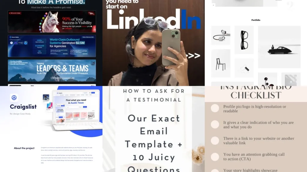
Here’s a tip nobody tells you. The banner image on your profile does more work than your headline, lol! People scroll fast and their eyes land on color before words.
That one detail is exactly why this list exists. Building a personal brand feels huge until you break it into small pieces you can actually finish this week.
So this roundup went through a ton of examples. Only the ones that looked doable without a design degree made the cut. No fancy software required, promise!
You’ll find ideas for your profile, your portfolio and your about page. Some are quick fixes. Others take an afternoon, tops.
Use whatever fits your field right now. Skip the rest and come back later, no pressure at all.
Ready to make your online presence feel like actually you? Let’s get into it!
PERSONAL BRAND IDEAS TO TRY THIS YEAR
Bold Headline Banner Design
A bold banner turns a plain profile into something people remember. Bright color blocks with a short tagline work better than a busy photo collage.
Keep the text under seven words so it reads in two seconds flat. That’s about how long anyone actually looks at it, lol!
- Two colors, one message
- Free tool does the whole thing
- Swap it out every quarter
Signature Photo Style Tips
How much does a photo really matter? A lot, honestly. Natural light against a plain wall beats a studio shot most of the time.
Pick one background color and stick with it across every platform. Consistency reads as intentional even when the photo was taken in five minutes.
- Window light beats a ring light
- Shot on a phone works fine
- Same crop everywhere
Carousel Post Template Ideas
Carousel posts get more time on screen than a single image ever will. That extra swipe time is basically free attention.
Ten slides with one idea per slide is the sweet spot. Cramming three ideas into one slide is where most carousels lose people, haha!
Number the slides so readers know how far they have left to go.
- The swipe is the whole strategy
- Ten slides keeps it tight
- One point per slide, always
Personal Logo Design Inspiration
A personal logo sounds fancy but it can be as simple as your initials in a shape. Think less corporate crest, more little stamp.
This works especially well for freelancers who want something recognizable on invoices and slide decks. Not every logo needs to be complicated to look put together.
- Initials in a circle, done
- No design software needed
- Works on invoices too
Minimalist One Page Portfolio
A one page portfolio removes every excuse a visitor has to click away. Everything they need sits on a single scroll. If you were hunting for portfolio website ideas simple, this one is a keeper!
This is the setup a lot of the these advice online actually points back toward, because a simple link is easier to share in a message or a bio.
- One scroll, zero confusion
- Loads fast on mobile
- Fits three projects max
Clean Grid Layout Portfolio
A grid layout makes visual work look organized without any extra effort. Photographers and designers lean on this one for good reason.
Even, square thumbnails give the whole page a calm feeling. Messy sizing is the fastest way to make a portfolio look unfinished.
- Even squares, calm vibe
- Free template gets you started
- Looks sharp on any screen
Simple Case Study Format
Skip the ten page write up nobody finishes reading. A simple case study format sticks to three parts, the problem, the fix and the result.
Add one number if you can, like a percentage or a dollar figure. Numbers make the result feel real instead of vague.
Behind The Scenes Photo Layout
Behind the scenes photos make an about page feel like an actual person wrote it. A messy desk shot does more than another posed headshot ever could.
Three or four casual photos next to a short story is plenty. This is one of the about page ideas personal brands often skip, which is a shame because it’s the part people remember.
Nobody scrolls an about page for corporate language, lol!
- The messy desk photo wins
- No professional shoot needed
- Three photos is plenty
Testimonial Request Email Template
Asking for a testimonial feels awkward for almost everyone. A short email template fixes that instantly.
Keep it to three sentences and include one specific question, like what result they noticed. Vague requests get vague answers every single time.
One of the best testimonial collection tips is simply asking right after a win, while the good feeling is still fresh.
- Ask while it’s still fresh
- Three sentences, tops
- One specific question works best
Video Testimonial Setup Guide
Video testimonials carry more weight than written ones because people can hear the tone. A phone propped against a stack of books is genuinely all you need.
Send three quick questions ahead of time so nobody freezes on camera. Keep the whole clip under ninety seconds, no exceptions.
- Phone on books, lights off
- Ninety seconds keeps it tight
- Questions sent ahead of time
Professional Bio Checklist Card
Last but definitely not least, a bio checklist keeps every platform consistent. Same name, same photo, same three line summary everywhere you show up.
Run through an online presence checklist professional profiles use before you call anything finished. It only takes ten minutes but it catches the little gaps nobody notices until a client does.
- Ten minutes, every gap caught
- Same bio on every platform
- Printable checklist card