20 Digital Planner Setup Ideas That Actually Get Used
Skip the intro · jump to the list ↓
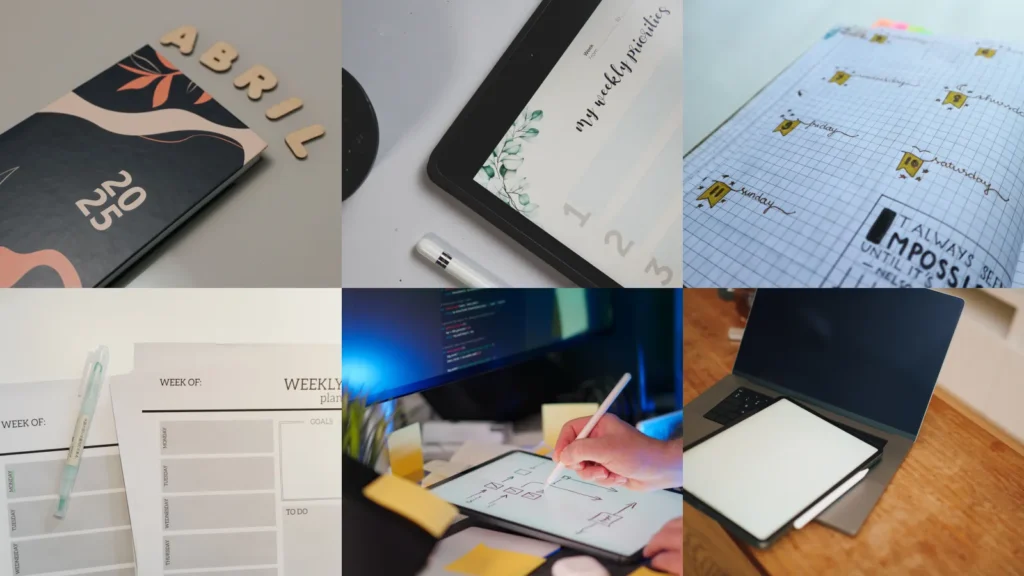
I bought my first digital planner during a very specific phase of my life, which was the phase where I thought a new app was going to fix the fact that I am, at my core, a person who forgets things.
It did not fix that but it did make me weirdly obsessed with the setup part, the tabs and covers and stickers, way more than the actual planning part.
So here are twenty ways to set one up.
20 Setup Ideas Worth Stealing
1. Start With a Cover That Matches the Season
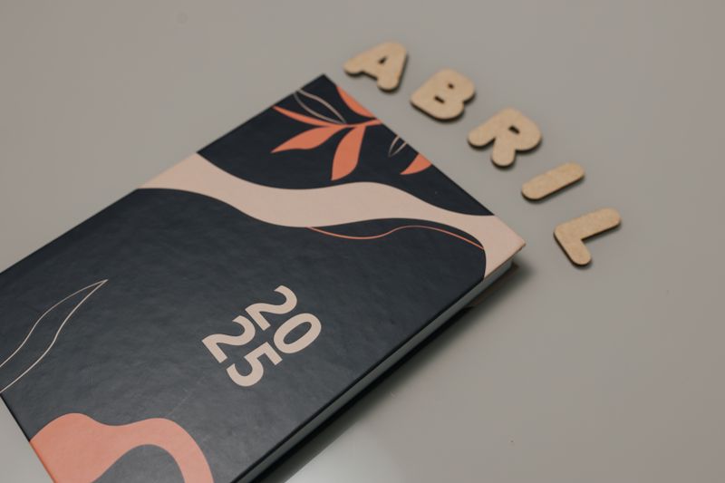
This is one of the simplest planner cover ideas digital planners actually reward you for trying, because unlike a paper cover, you can just swap it out. I change mine four times a year and it genuinely resets how I feel about opening the thing.
My cover right now is a sort of muted green with a little line drawing of a mug on it. Nora says it looks like nothing. I like that it looks like nothing.
2. Build a Tab System You Won’t Abandon
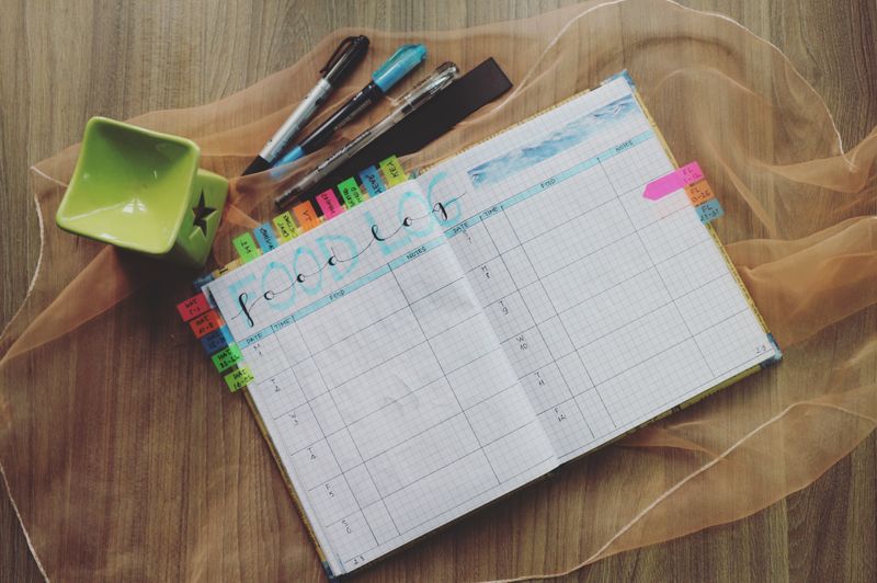
I tried a nine tab system once. Nine. I used maybe three of them regularly and the rest just sat there being ignored, which honestly stressed me out more than having no tabs at all.
Now I keep it to four: Weekly, Notes, Goals, and one I just call Random. That last one holds everything from grocery lists to a half-finished packing list for a trip I have not booked yet.
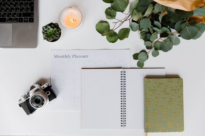
3. Set Up a Monthly Overview First
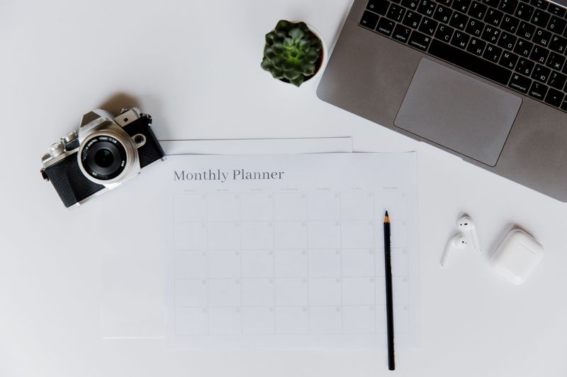
I always build the month before I touch the weeks, because otherwise I forget things like dentist appointments exist until the day before.
A simple grid with color coding by category, work in one color, personal in another, has saved me more than once.
4. Design a Weekly Spread With Actual Breathing Room
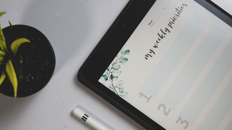
The best weekly spread digital planner ideas I have seen are not the packed ones with a box for every single hour. They are the ones with a little empty space left over, because life adds things in on Tuesday that you did not know about on Sunday.
Mine has a column down the side just labeled “shifted,” for tasks that keep getting pushed. It is oddly comforting to see them all in one place instead of scattered across three different days.
5. Add a Habit Tracker That Isn’t Overwhelming
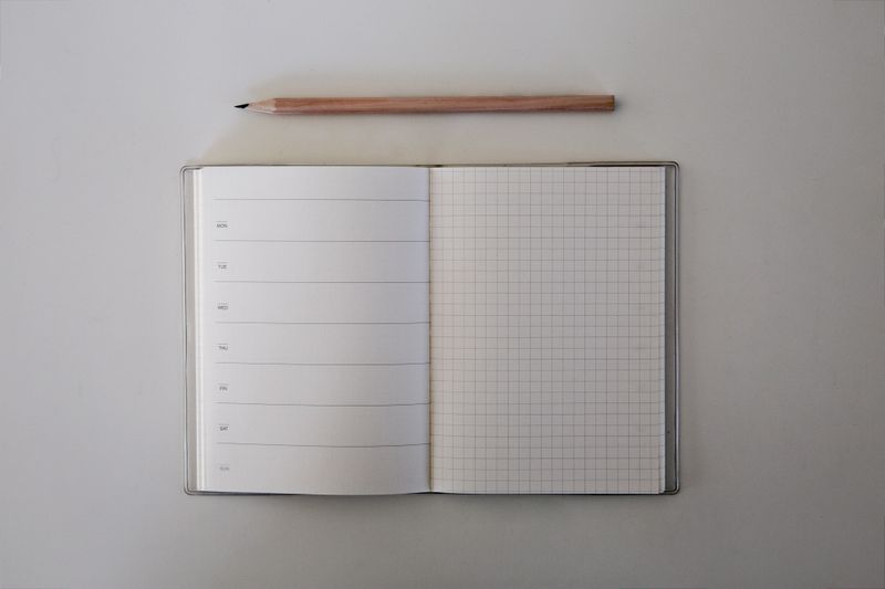
I once made a habit tracker with fourteen habits on it. Fourteen.
I lasted four days before the sight of all those empty boxes made me want to close the app entirely. Now I track three things, water, a walk, and reading, and I actually fill it in.
6. Use Digital Stickers Instead of Colored Pens
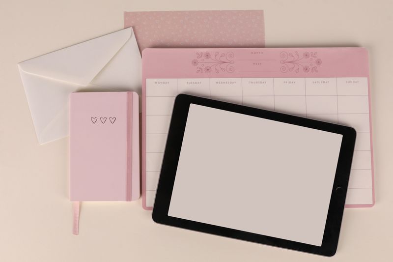
Some of my favorite planner sticker ideas digital users share are just tiny icons, a coffee cup for errands, a little suitcase for travel days.
I have a sheet with maybe sixty of these and I reuse the same dozen constantly.
7. Keep a Dedicated Page for Recurring Bills
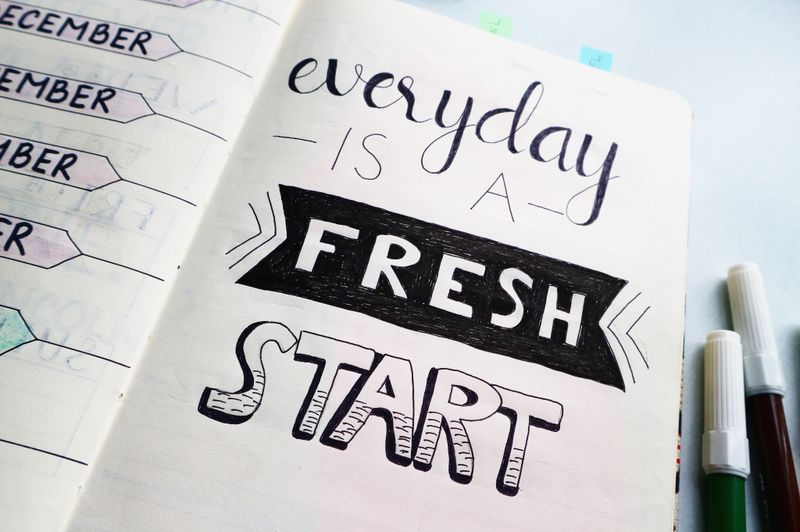
Nothing fancy here. A list, due dates, a checkbox.
But having it inside the same planner as everything else means I stopped losing track of which bill I already paid, which used to happen at least once a month.
8. Try a Vertical Layout Instead of a Horizontal One
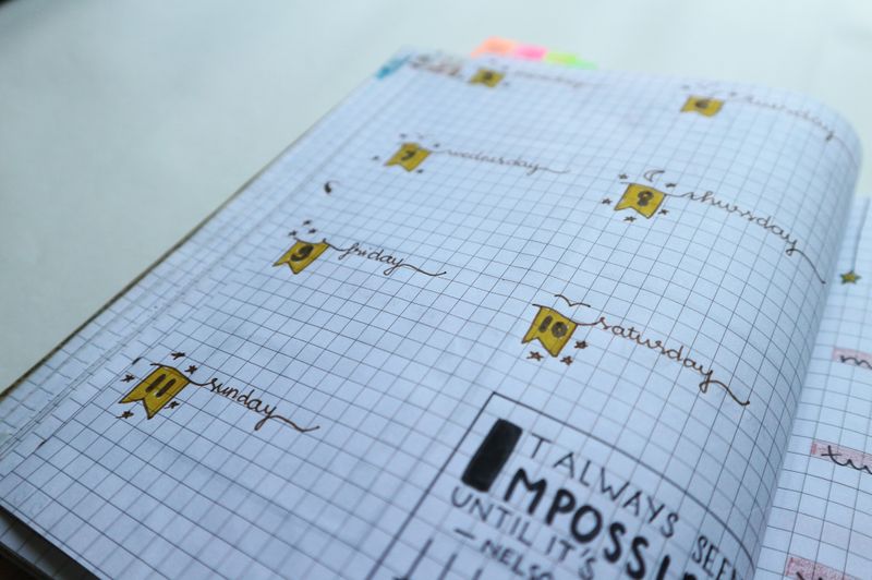
I switched from horizontal to vertical last year and it took some getting used to, honestly, but now I cannot imagine going back.
Seeing each day as its own tall column instead of a short row makes the whole week feel less crammed.
9. Build a Meal Planning Section
My mom does this on paper still and refuses to switch, which is her right, but I put mine right in the same planner as everything else so grocery day and meal day live in one place.
10. Set Aside a Page Just for Brain Dumps
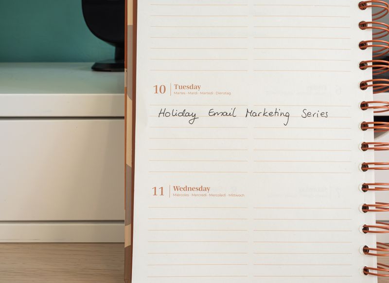
One page, totally unstructured, where I just type or scribble whatever is rattling around before bed.
Half of it is nonsense but getting it out of my head and onto a page I can close is worth the clutter.
11. Use a Different Font for Each Category
This one sounds fussy and it kind of is, but assigning a specific font to work tasks versus personal ones means I can tell at a glance what kind of day I am looking at without reading a single word.
12. Set Up a Yearly Goals Overview
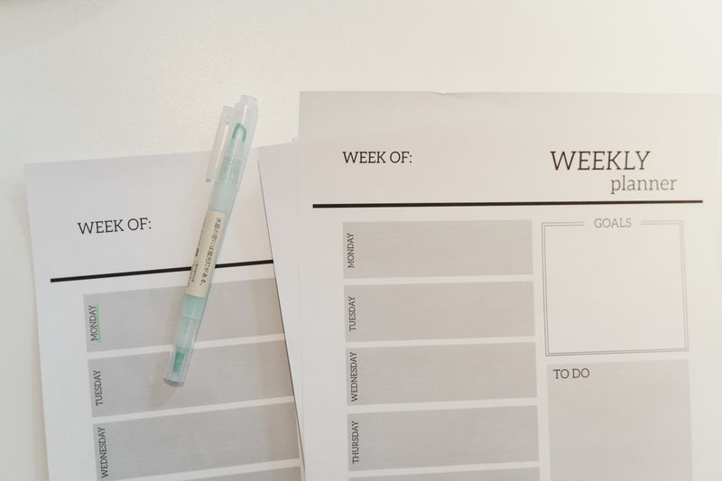
I keep this one short on purpose, four or five goals max, broken into quarters.
I like to check it maybe once a month, which is honestly plenty, and it stops me from forgetting I even set goals in January.
13. Make the Most of iPad Split Screen
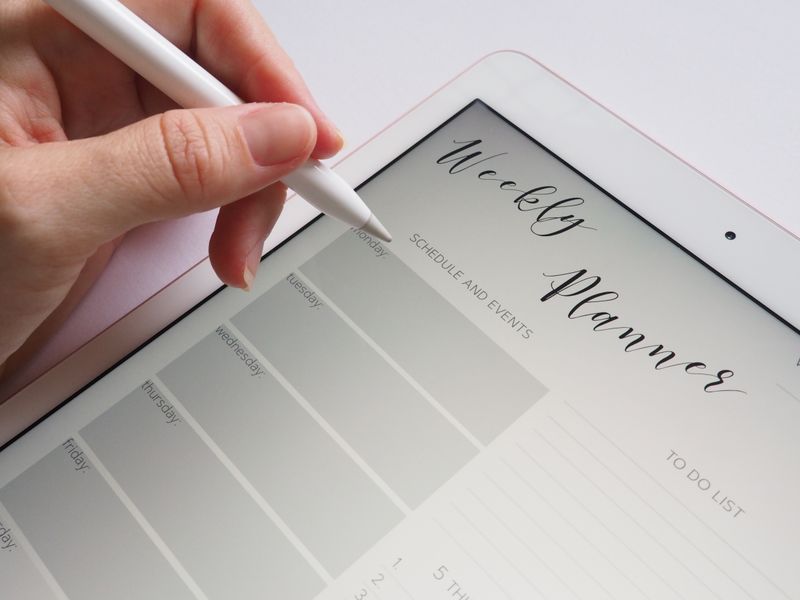
This is one of the ipad planner ideas that changed things for me more than any layout ever did.
Having the planner open on one side and a browser or notes app on the other means I stop switching apps every ten seconds, which was the actual source of most of my distraction, not the planner itself.
14. Add a Reading or Watch List Page

Nothing groundbreaking. A running list of books and shows, checked off as I get through them. Theo makes fun of me for tracking this at all, but I like seeing the list grow more than I expected to.
15. Try a Two Page Weekly Layout for More Room
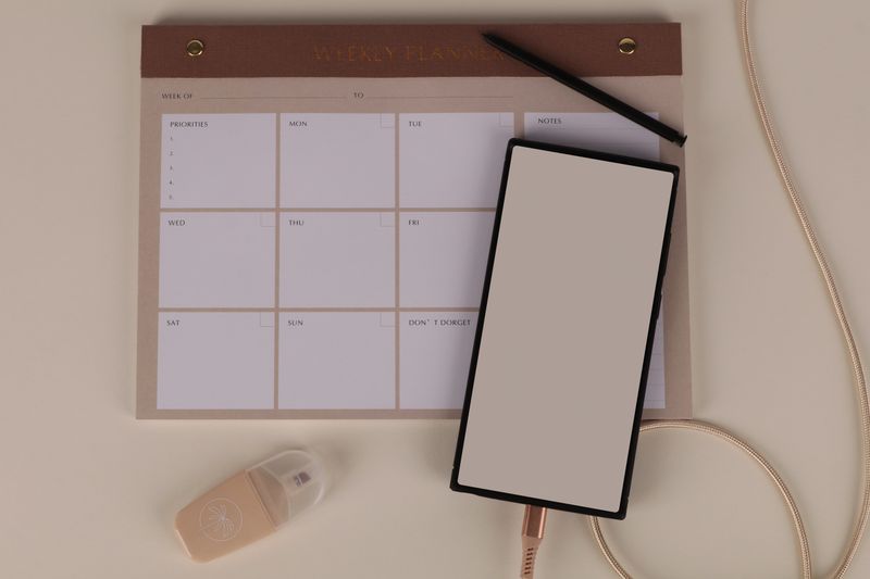
If a single page weekly feels cramped, spreading it across two pages gives each day enough room to actually write something useful instead of three cramped words. I switched to this during a particularly busy stretch and never switched back.
16. Color Code by Person, Not Just Category

Marlene does this for her household and it looked so useful I copied it immediately. One color per person instead of per type of task. It sounds obvious once you see it, but it took me embarrassingly long to think of on my own.
17. Keep a Travel Planning Tab Separate From Daily Life
I keep flights, packing lists, and rough itineraries in their own tab, entirely separate from my weekly pages, because mixing “pack sunscreen” in with “pay the internet bill” made both feel less important than they were.
18. Set Up a Simple Password Vault Page
Not for anything sensitive, just the small stuff, wifi passwords for places I visit often, membership numbers, that kind of thing. It is not glamorous. It is genuinely one of the pages I open most.
19. Use a Minimal Cover If You Get Distracted Easily
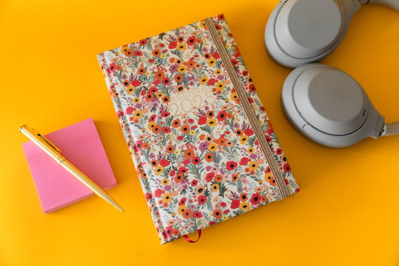
I went through a phase of covers so busy that opening the planner felt like opening a scrapbook, and I would get sidetracked looking at the art instead of my tasks. A plain cover fixed that immediately, if a little boringly.
20. Give Yourself a Blank Page No One Sees the Point Of
Mine has one small doodle and nothing else. No one needs this page. I keep it anyway, tucked at the very back, and I could not tell you why except that every planner needs one page that serves absolutely no purpose.
Just a little note - some of the links on here may be affiliate links, which means I might earn a small commission if you decide to shop through them (at no extra cost to you!). I only post content which I'm truly enthusiastic about and would suggest to others.
And as you know, I seriously love seeing your takes on the looks and ideas on here - that means the world to me! If you recreate something, please share it here in the comments or feel free to send me a pic. I'm always excited to meet y'all! ✨🤍
Xoxo Alice