20+ Home Office Paint Color Ideas: Make WFH Feel Better
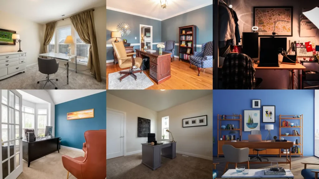

My desk sat facing a wall the color of wet cardboard for about four years before I did anything about it. I’d sit there on a Tuesday afternoon and genuinely feel my brain slow down, like the wall itself was tired and it was contagious.
So when Tessa repainted her home office a color she described as “a green that means business,” I got curious in the way I get curious about most things, which is to say I opened eleven tabs and did not close them for three days.
I looked at paint swatches, I looked at other people’s before and afters, I read way too many comment sections where people argued about whether navy makes a small room feel like a cave.
If your office wall is currently the color of nothing, like mine was, here are twenty ideas worth considering before your next can of primer.
20 Colors and Setups Worth Trying in Your Office
1. Deep Forest Green
This is the color Tessa went with, and I get it now that I have seen it in person.
I will say it is a commitment. This is not a color you casually paint over on a whim next spring.

2. Warm Terracotta
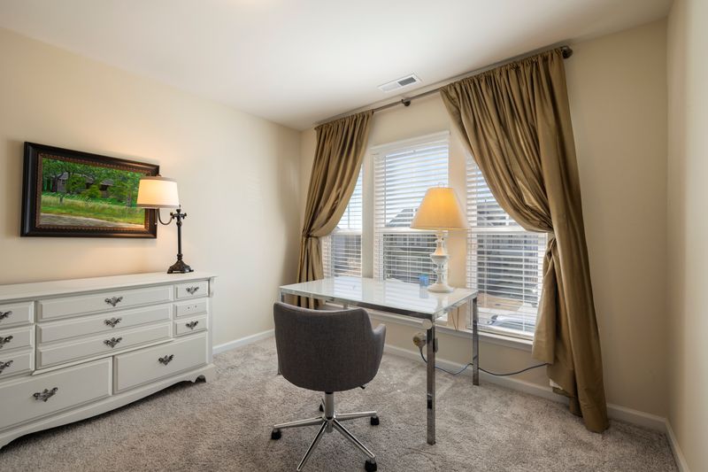

Terracotta showed up on almost every list I read, and I think it is because it manages to feel energizing and grounding at the same time.
It pairs well with the kind of warm wood furniture my brother Theo has been slowly collecting from estate sales for his own setup.
3. Soft Sage on Three Walls
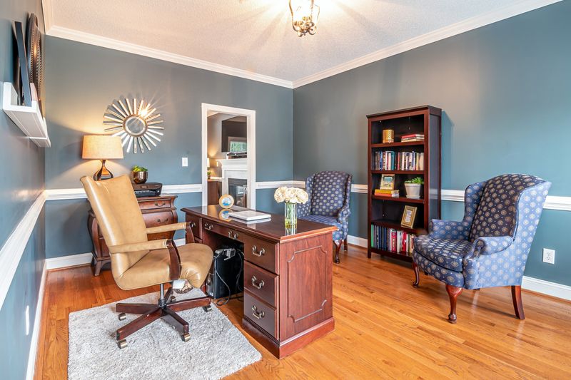
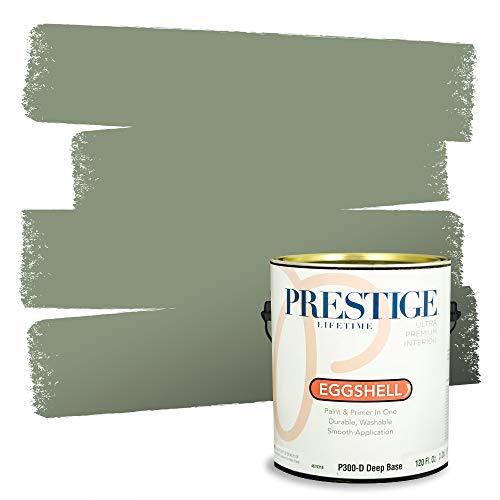
Soft sage is the color I keep seeing recommended for people who want calm without committing to full green.
The trick a few designers mentioned is leaving one wall lighter than the rest so the room does not feel like it is closing in on you.
4. A Moody Navy for Office Accent Wall Ideas
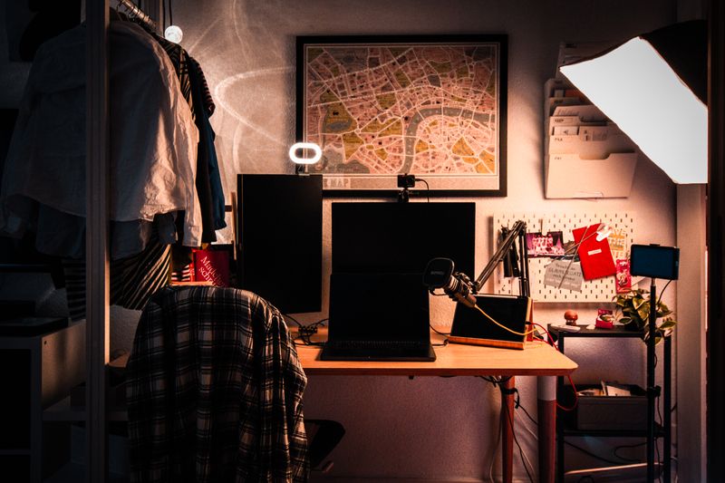

Navy came up constantly when I went looking for office accent wall ideas, and it makes sense once you see it done well. One wall in navy, the rest kept light, and suddenly the room has a focal point instead of just four flat walls doing nothing for you.
My neighbor Marlene did this behind her desk two years ago and still mentions it whenever anyone compliments her video calls. Apparently the color reads beautifully on camera, which I never would have thought to consider.
5. Butter Yellow for a North-Facing Room

If your office gets almost no direct sun, butter yellow keeps coming up as the fix.
It borrows warmth the room does not naturally have. I would be careful with the shade though, some of the yellows I saw online leaned closer to a highlighter than a butter, and that is a very different mood.
6. Chalkboard Paint for One Small Wall
- Doubles as a workspace tool
- About 2 hours
- Under $30
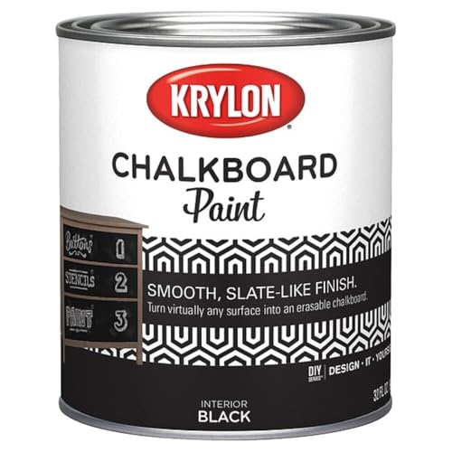
You need: chalkboard paint, roller, painter’s tape
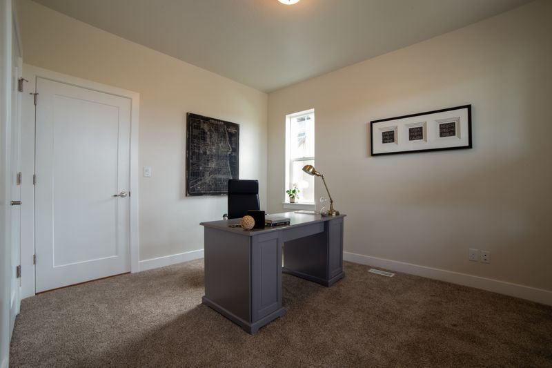
This is one of my favorite home office wall decor ideas because it is not really decor at all, it does actual work for you.
Theo painted a small section of his office wall with it and now sketches out project timelines directly on the wall instead of losing sticky notes everywhere.
7. Warm Greige as a Safe Base

I know, greige is the color everyone rolls their eyes at now.
But there is a reason it is still recommended so often for offices specifically, it does not compete with anything on your screen or your desk, and it photographs well if you do video calls all day.
8. A Dusty Blue That Reads Cooler Than Navy
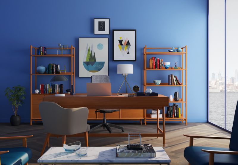

Dusty blue is the color I would probably pick for myself, honestly.
It has the calm of navy without the heaviness, and a few of the sleep and focus studies I stumbled across while researching this kept pointing to blue tones as genuinely good for concentration, not just a design trend claim.
9. Charcoal With Metallic Accents
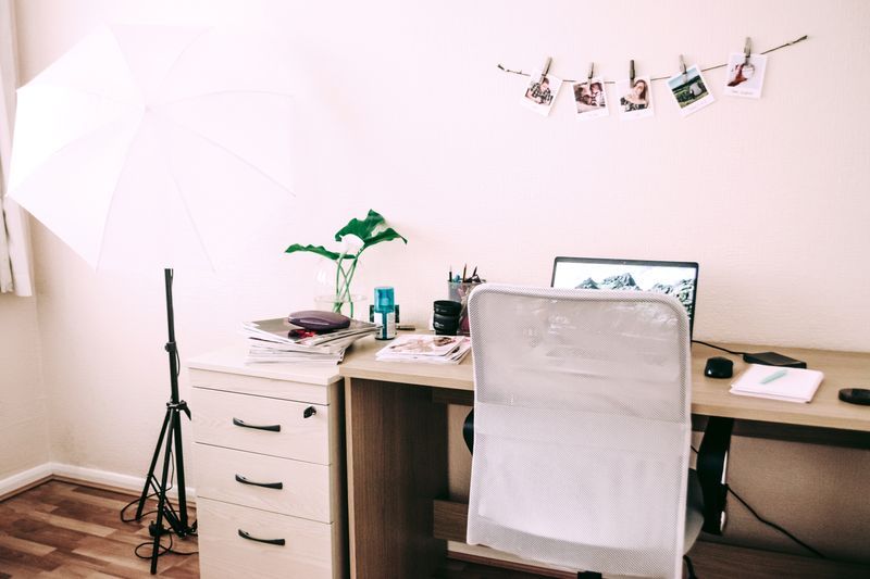

Charcoal is dramatic, and it is not for every room or every person.
But paired with brass or gold frames it stops feeling heavy and starts feeling intentional. This is one where lighting matters enormously, a charcoal wall under bad overhead lighting can look flat and sad fast.
10. A Blush Pink for a Softer Focus Room
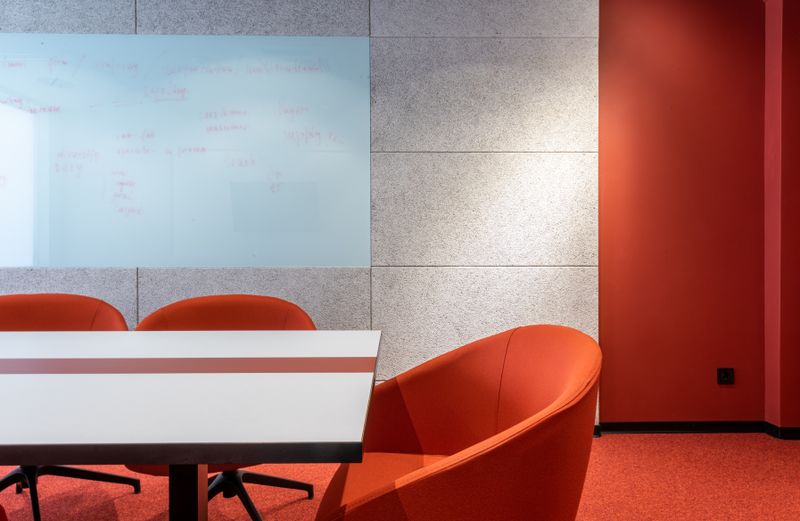

Blush gets dismissed as too soft for a work space, but I saw a handful of home offices done this way that looked genuinely calming rather than fussy.
11. Olive as a Grown-Up Alternative to Sage
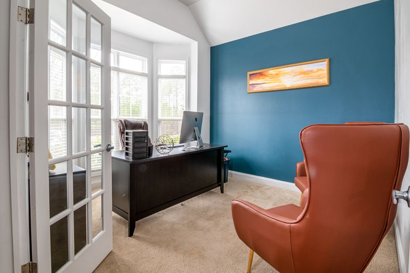

Olive sits somewhere between sage and forest green, and I like that it does not read as trendy the way some greens do right now. It should age well, which matters if you are not planning to repaint every two years.
12. A Bold Terracotta Pinboard Wall
- Function built right into the wall
- Weekend project
- Under $60
You need: cork tiles, paint, adhesive
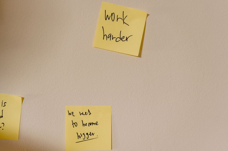
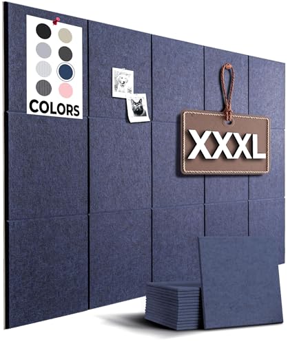
This is one of the better office pinboard ideas I have come across because it solves two problems at once, it gives you somewhere to pin actual notes and photos, and it adds color without a full repaint. My mom did something similar in her sewing room years ago, just cork tiles glued up and painted to match the wall around them.
13. Deep Plum for a Windowless Room
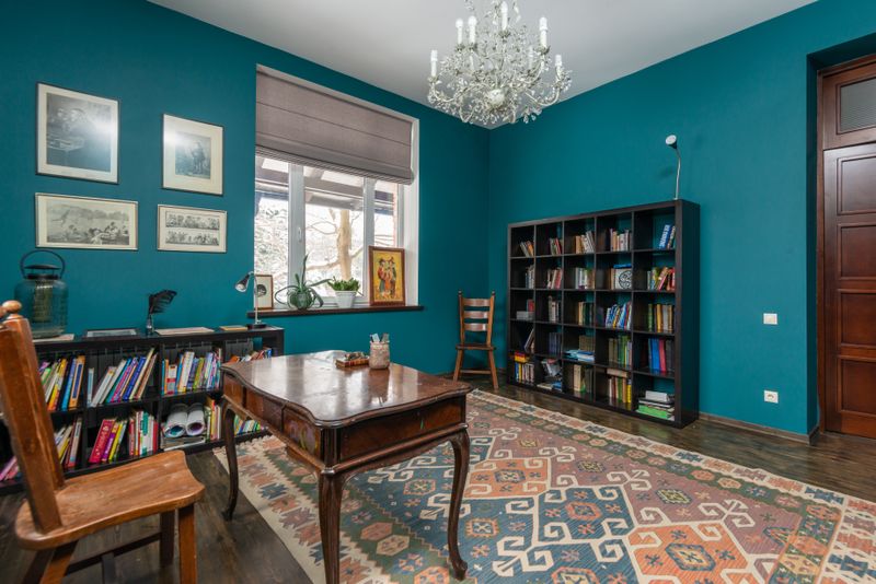

I was skeptical of this one, a dark color in a room with no natural light sounds like a mistake waiting to happen. But apparently the trick is leaning into it fully rather than fighting it, letting the room feel intentionally moody with good lamp lighting instead of trying to brighten a space that just is not going to get bright.
14. A Motivational Word Wall in a Bold Font
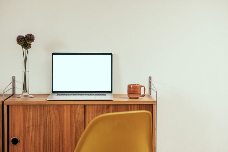

Some of the best motivational wall ideas office setups I found were not posters at all, they were just one word stenciled straight onto the paint. Focus, Begin, whatever gets you moving.
It is a small thing, and I will admit I rolled my eyes a little at first, but the ones done in a color that contrasts with the wall actually look sharp rather than cheesy.
15. Warm White With Wood Tones
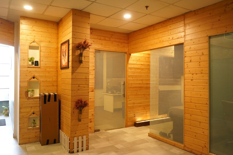

Warm white sounds boring on paper, and I almost skipped it while researching, but paired with light wood shelving it ends up feeling more like a calm study than a blank room. This is a safe one if you share the space with someone who has strong opinions about color and you do not.
16. A Two-Tone Wall Split at Chair Rail Height
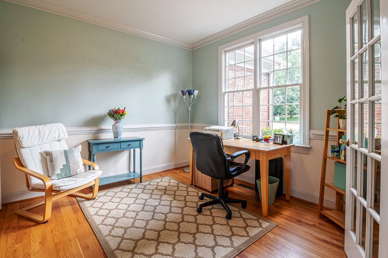

Darker on the bottom, lighter on top, split right at chair rail height. This one takes more patience than a single color, mostly because of the taping, but the finished look reads far more custom than the effort actually was.
17. Mustard as a Small Dose Accent
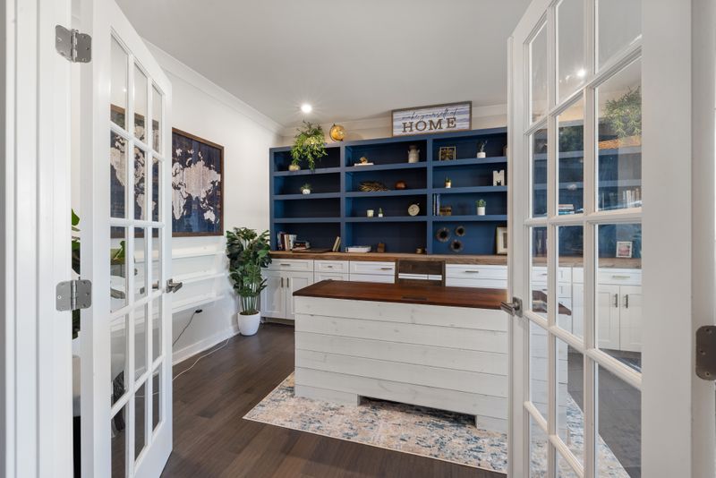
Mustard as an entire wall can be a lot. Mustard as one small nook, a reading corner or a shelf backdrop, is a different story entirely.
I saw this done in a converted closet office and it worked because it stayed contained.
18. Cool Gray for Screen-Heavy Work
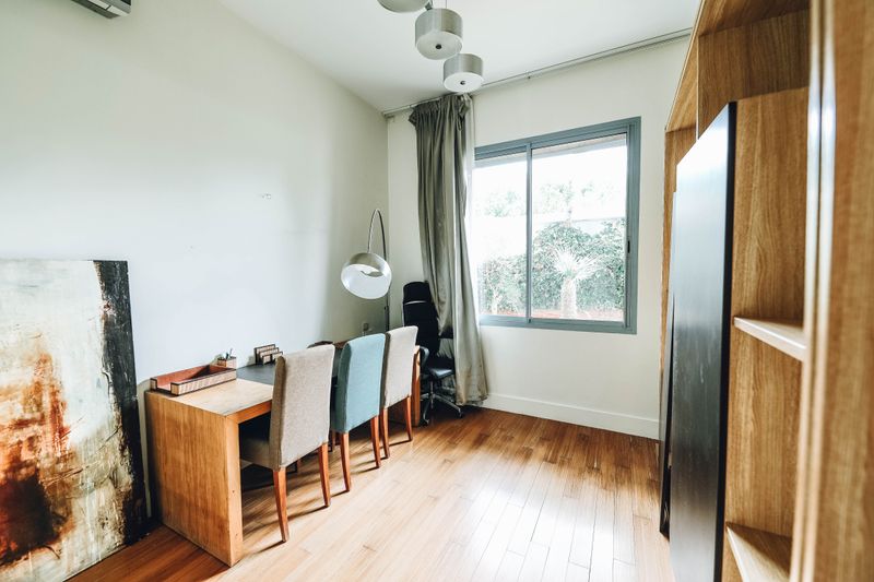

A few articles I read while researching monitor glare and eye strain kept coming back to cool gray as the least distracting backdrop for anyone staring at two screens all day. It is not exciting, and I would not call it inspiring, but it does its one job well.
19. A Gallery Wall Painted a Shade Darker Than the Rest of the Room
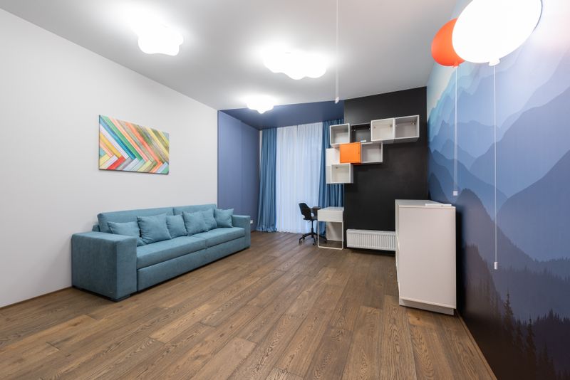

This is a smaller version of the accent wall idea, just the section behind a gallery of frames painted a shade darker than everything around it. It makes the frames pop without needing a bold color choice for the entire room, which I liked because it feels less permanent if you change your mind.
20. Sky Blue With a Cloud Mural Detail
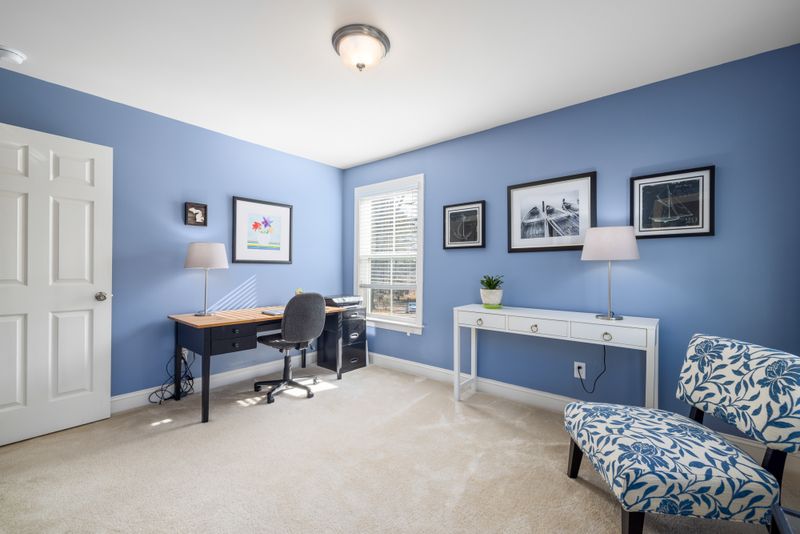
This one is a little whimsical, I know. But a soft sky blue with a small hand-painted cloud detail near the ceiling shows up in more home offices than I expected, especially ones that double as a kid’s homework spot during the day and someone’s actual work desk at night.
It keeps the room feeling light instead of clinical.
Related stories
- 12 Color Pairings That Look Professional - My Full Guide
- 20+ Zoom Background Ideas Home Office: Make WFH Feel Better
- 20 Aesthetic Desk Setup Ideas That Make You Actually Want to Sit Down
- 16+ Moody Bedroom Ideas That Make You Never Want to Leave
- 20+ Small Home Office Ideas for Women: Make WFH Feel Better
- 30+ Half Bath Ideas Prove Even Small Spaces Transform