12 Color Pairings That Look Professional – My Full Guide
IG: jelenasimeonova
Hi ladies, let’s grab a coffee or a matcha cause today we are diving into something that honestly used to stress me out so much every single morning. Office clothes. More specifically, how to actually wear color to work without looking like a walking highlighter or like you are going to a music festival.
I feel like when we start our careers or get a new job, we all default to the same thing. Black pants, white shirt, maybe a grey sweater if we are feeling crazy. And don’t get me wrong, I love a good neutral moment. But wearing the same sad colors every day kinda drains your energy. I realized a while ago that color is actually your best friend if you know how to pair it right. It makes you look put together, confident, and like you actually know what you’re doing – even on the days where you are totally just winging it.
So me and my roommate were talking about this the other night while tearing our closets apart, and it inspired me to write this.
1. Navy and Camel
Okay we are starting strong with the absolute holy grail of professional dressing. Navy and camel is just so chic and elevated. It literally screams “I have my life together and my inbox is at zero” – even if you have 500 unread emails.
I actually have a funny story about this one. Back when I was 22, I had this massive interview for a PR agency. I was so nervous I was practically shaking on the train ride there. I had decided to wear these tailored navy trousers with a soft camel turtleneck and a navy blazer over it. The moment I walked into the lobby and caught my reflection in the glass doors, I instantly felt like a boss. Like my posture literally changed. I ended up crushing the interview and getting the job, and I swear the outfit gave me that extra push of confidence. So yeah, if you need a power outfit, this is it.
2. Olive Green and Cream
This is for my girls who love earthy tones but still need to look corporate. Olive green is such an underrated color for the office. It is grounded, calming, and it looks so incredibly expensive when you pair it with a rich cream or off-white.
Try an olive green slip skirt with a chunky cream sweater half-tucked in. Or olive wide-leg pants with a crisp cream button down. It is slightly unexpected but totally appropriate for literally any meeting. You will look amazing.
3. Burgundy and Charcoal Grey
When fall and winter roll around, this is my absolute favorite combo. There is something about deep burgundy mixed with dark charcoal grey that feels so sophisticated and smart.
If you wear a lot of black, charcoal is a really good stepping stone to soften up your look. A charcoal blazer thrown over a burgundy silk cami or blouse is just stunning. It feels rich and moody but keeps things very strictly professional. Plus it transitions so well into happy hour drinks after work, which is obviously a huge bonus.
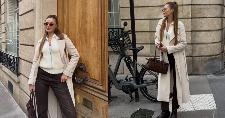
4. Chocolate Brown and Soft Blue
Okay hear me out on this one cause it sounds weird at first. Brown and blue? But trust me, it is the coolest combo ever. It has a very vintage, academic vibe that is super trendy right now.
A few weeks ago I found this gorgeous vintage chocolate brown blazer at a thrift store. I brought it home and had no idea what to wear it with, until I threw it on over a soft baby-blue Oxford shirt. I was obsessed. The warm brown grounds the outfit, while the cool blue keeps it fresh and awake. Definitely try this one if you want to stand out a little bit in the sea of boring office clothes.
5. Rust Orange and Deep Navy
I know orange sounds absolutely terrifying for an office environment, but we are talking about a deep, muted rust color. Paired with navy, it is a match made in heaven. It feels very creative and energetic.
I actually discovered this combo by total accident. There was this one Tuesday where I was rushing to a morning meeting and I literally dumped my entire iced coffee all over my white blouse right before I walked out the door. Total disaster. I ran back to my closet panicking, grabbed the first clean top I saw which was a rust-colored silk tank, and threw it on under my navy suit. I got to the office and my manager actually stopped me to tell me she loved my outfit. Crisis averted and a new favorite combo was born. You honestly have to try it.
6. Forest Green and Beige
If you want to look approachable but still authoritative, this is the way to go. Forest green is such a beautiful, rich color that flatters basically every single skin tone.
Instead of relying on your usual plain neutral tones, use a warm beige or sand color to brighten up the dark green. A beige trench coat over a forest green dress is a classic look that never goes out of style. It feels very British heritage, kinda like you should be walking through London on a rainy day instead of sitting at a desk.
7. Dusty Rose and Slate Grey
I love pink, but wearing bright pink to the office can sometimes feel a bit too Elle Woods. Which is a total vibe, but maybe not what you want for a serious budget presentation, you know? That is where dusty rose comes in.
Dusty rose is muted, soft, and feminine. When you pair it with a cool slate grey, it balances out the sweetness perfectly.
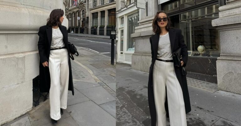
8. Classic Black and Crisp White
I know I said we are moving away from boring colors, but I had to include this because it is iconic for a reason. Black and white will always look professional. The trick is how you style it so you don’t look like a waiter at a fancy restaurant.
It is all about the textures and the silhouette. Mix a really structured, oversized black blazer with a flowy white silk skirt. Or wear crisp white wide-leg trousers with a fitted black cashmere knit. As long as the shapes are modern, this color pairing will always make you look like the chicest person in the room.
9. Mustard Yellow and Dark Mocha
This gives off major 70s vibes but in the best way possible. Mustard yellow is a warm, happy color, and dark mocha brown keeps it grounded and professional.
If a mustard sweater feels like too much for you, just use it as an accent. A dark brown dress with a mustard scarf or a structured mustard tote bag. It adds such a fun pop of color to a gloomy work day.
10. Teal and Crisp White
Whenever I need a mood boost, I reach for teal. It is brighter than navy but much more professional than a bright turquoise. It just looks so incredibly fresh and clean when you wear it with bright, stark white.
I love doing a tailored teal pant with a simple white tee and some cool loafers. It is the perfect business casual outfit for a Friday. You look totally put together, but you also look like you are ready to head out for weekend brunch as soon as the clock hits 5 PM.
11. Lavender and Black
Pastels for work? Yes, absolutely. But you have to anchor them. If you wear lavender with white, it can look a little too much like Easter Sunday. But if you pair it with harsh, solid black, it creates this amazing contrast.
The softness of the lilac against the edge of the black just works. A black pencil skirt with a lavender button down is a really easy way to pull this off. It is feminine but fierce.
12. Tonal Grey (Monochrome)
Okay we made it to the last one, and honestly this might be my favorite power move of all time. Wearing all grey – but mixing different shades of grey – is the ultimate cheat code to looking expensive.
Last month I had a super intimidating meeting with the board of directors at my company. I wore light grey trousers, a medium grey cashmere turtleneck, and a dark charcoal coat. Let me tell you, I felt like a CEO. Monochrome dressing elongates your body and makes everything look custom tailored.
Just a little note - some of the links on here may be affiliate links, which means I might earn a small commission if you decide to shop through them (at no extra cost to you!). I only post content which I'm truly enthusiastic about and would suggest to others.
And as you know, I seriously love seeing your takes on the looks and ideas on here - that means the world to me! If you recreate something, please share it here in the comments or feel free to send me a pic. I'm always excited to meet y'all! ✨🤍
Xoxo Alice