20+ Genius Cover Letter Opening Lines Ideas Worth Stealing
Skip the intro · jump to the list ↓
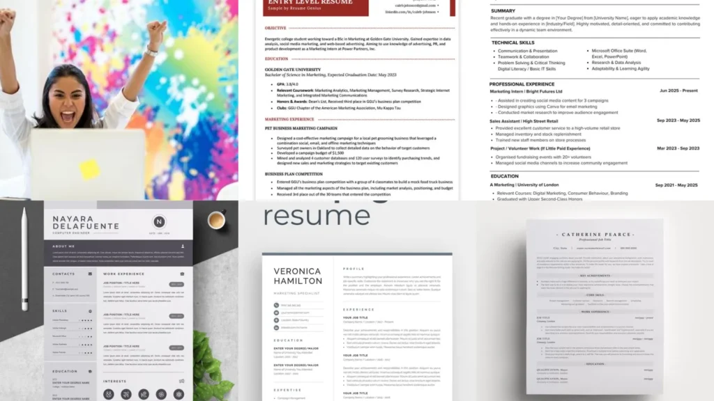
Staring at a blank cover letter with the cursor just blinking at you? Same. There are a thousand ways to start one and somehow none of them feel right at midnight.
That blank page problem is exactly what this list fixes. Instead of scrolling forever, you get 12 ideas that actually work, sorted by what they solve.
Some of these are opening lines for your cover letter. Others cover your resume itself, from the summary at the top down to the white space around your name.
Every idea here was picked because it’s doable in an evening, not because it looks fancy in a design portfolio somewhere. No expensive software required, lol!
Whether you’re switching careers or polishing a resume you’ve had since college, there’s something in here for you. Grab a coffee and let’s get your application looking sharp.
Use whatever fits your situation and skip the rest. This isn’t a checklist, it’s a menu, so pick what actually applies to you!
COVER LETTER AND RESUME IDEAS
Bold Confidence Opening Line
We’re starting off strong with a bold opener that skips the boring introduction entirely. Instead of ‘I am writing to apply for,’ try leading with a specific result you achieved.
Something like ‘Last year I helped cut customer wait times by 40 percent. I want to do the same for your team’ grabs attention immediately. Hiring managers read hundreds of these, so confidence stands out fast.
- Reads the pile in under ten seconds
- One sentence, one big result
- No apology tone anywhere
Creative Career Change Opener
Switching industries makes opening a cover letter feel extra tricky. How do you explain a jump from teaching to marketing without sounding lost?
This creative opener leans into the change instead of hiding it. Try something like ‘Five years in a classroom taught me more about persuasion than any marketing course could.’ It turns the pivot into your strongest selling point.
- Turns a weird jump into a strength
- Works for any career switch
- No need to explain the gap
Entry Level Resume Summary Example
Not much work history yet? That’s fine. Entry level resumes lean on potential instead of a long track record. The summary line is where that shows up.
One of many strong resume summary examples for new grads is something like ‘Recent marketing graduate with hands-on internship experience and a habit of finishing projects early.’ Short, specific and confident does the trick every time.
- Built for zero to two years experience
- Leads with internships and coursework
- Two or three sentences max
Executive Level Resume Summary
Executive resumes carry a different weight entirely. The summary at the top has to prove leadership fast, since nobody’s scrolling down to find it.
A strong version reads something like ‘Operations executive who scaled a 15 person team into a department of 80 without missing a single quarterly target.’ Numbers do the heavy lifting here, so use real ones whenever you can.
- Leads with scale not job titles
- One big number per line
- Written for a ten second skim
Hard Skills List Layout
A cluttered skills section is a missed opportunity. Grouping hard skills into short categories makes the whole thing easier to scan. If you were hunting for skills section ideas resume, this one is a keeper!
Try headers like Software, Certifications and Languages, then list three or four items under each. It reads faster and looks a lot more organized than one long run-on line.
- Sorted so nothing gets buried
- Grouped into three tidy columns
- Scannable in five seconds flat
Skill Bars Resume Design
Skill bars look sleek on a screen, but they cause real trouble in real hiring systems. Many applicant trackers can’t read graphics at all.
If a template offers filled in progress bars, think twice before using them for anything but a personal portfolio site. A simple bullet with the skill name and years of experience will get through the scanner every time.
- Pretty on Canva, risky in real life
- Safe as a design portfolio piece
- Skip it for tracker software
Margin Balance Resume Layout
Margins get overlooked constantly, but they change how a whole page feels. Shrinking them to squeeze in more text usually backfires.
Keep margins between half an inch and one inch on every side. A page with room to breathe reads as more confident than one crammed edge to edge, honestly.
- The frame nobody notices on purpose
- Half inch to one inch all around
- Never smaller just to fit text
Clean Spacing Between Sections
Here’s one of the easiest resume white space tips out there: give your sections room to breathe. Cramming your job history right up against your education section makes everything blur together.
A little extra spacing between sections lets the reader’s eye rest for a second before moving on. It sounds small, but it makes the whole document feel far less exhausting to read.
- The pause your eyes didn’t know they needed
- Ten to fourteen points between sections
- Consistent gap top to bottom
Minimalist Resume Breathing Room
A minimalist layout isn’t about doing less, it’s about letting the good things stand out. Too many resumes pack every inch full because the writer is scared of looking underqualified.
Trust the empty space. It signals confidence, not laziness. A recruiter skims a busy page in seconds and gives up; a clean one actually gets read.
- Empty space that works in your favor
- Fewer bullets, stronger ones
- Room around headers on purpose
Condensing Experience One Page
Got fifteen years of history and one single page to fit it in? Rough spot. The trick is cutting older roles down to a single line each.
Anything past ten years back gets one bullet, tops. Save the detailed bullets for your last two jobs, since that’s what recruiters actually care about anyway.
- Fifteen years shrunk to one page
- Older roles get one line each
- Recent jobs keep the detail
Font Size One Pager
Font size is one of the fastest fixes when your resume spills onto a second page. Dropping from 12 point to 11 point can save an entire section without anyone noticing.
Don’t go below 10 point though, since that starts to strain the eyes fast. A clean 11 point body with a slightly larger name at the top usually does the job.
- The half point that saves a whole page
- Body text at 10 to 11 point
- Name slightly larger at the top
Single Column One Page Layout
Last but definitely not least, let’s talk layout. A single column keeps everything reading top to bottom in a natural order, which is exactly how most hiring software scans a page.
Two column templates look nice, but they confuse a lot of tracking systems and jumble the reading order. When in mind of one page resume tips, a plain single column stays the safest bet by far.
- Straightforward and scanner friendly
- Reads top to bottom naturally
- Plays nice with tracking software