Neutrals for Modest Workwear to Avoid Looking Washed Out
IG: fleurraffan
So, you know that whole modest workwear aesthetic? The one where everything is super classy, perfectly layered, and drenched in those beautiful, calming neutral tones?
Yeah, I am absolutely obsessed with it. Like, my entire Pinterest feed is basically just girls in gorgeous modest beige and cream outfits looking like they have their entire lives together. But let me tell you a little secret between you and me – dressing in head-to-toe neutrals while keeping things modest is actually super tricky. If you do it wrong, you don’t look like a chic CEO. You look like you haven’t slept in a week.
And I know this from painful, personal experience.
The Great Oatmeal Disaster
Okay, picture this. It was a random Tuesday last November, and I had this massive presentation at work. I wanted to look super professional but also comfortable, so I decided to go all out with the neutral modest vibes. I put on this loose oatmeal-colored turtleneck, a matching beige midi skirt, and this long, flowy cream cardigan over it.
In my bedroom lighting? Stunning. I thought I looked like a minimalist fashion blogger. I was literally hyping myself up in the mirror.
But then I got to the office. Have you guys ever noticed how incredibly evil corporate fluorescent lighting is? Because wow. I walked into the conference room, and I swear, I caught my reflection in the glass door and jumped. The cool, harsh lights mixed with all that flat beige washed out my skin so badly that my lips completely blended into my face. I literally looked like a walking bowl of plain oatmeal.
To make it worse, my manager pulled me aside right before the meeting and whispered, “Hey Anne, you look a little pale today. Are you feeling okay? You can go home if you’re coming down with something.”
Guys. I wasn’t sick. I was just wearing the wrong beige.
It was honestly so embarrassing, but it forced me to realize something super important. When you dress modestly, you are wearing more fabric. You’re covering more skin, which is beautiful and elegant, but it also means the colors you wear have a massive impact on your face. If you pick a neutral that drains you, and then you drape your entire body in it, it’s just a recipe for looking completely exhausted.
So yeah. I went on a massive deep dive to figure out how to fix this, and I want to share everything I learned with you. Let’s fix our neutral game together.
Step 1: The Undertone Rule (Which I Thought Was Fake News)
For the longest time, I honestly thought the whole “undertone” thing was just something makeup artists made up to sell more foundation. I was so wrong. Understanding your undertone is literally the secret code to wearing neutrals without looking sick.
Here is the absolute simplest way to figure it out. Go look at the veins on your wrist right now in natural window light. Are they giving off a bluish-purple vibe? You probably have cool undertones. Do they look a little green? You’re a warm-toned girlie. If you can’t really tell, you might be neutral.
Why does this matter for our modest office fits? Because neutrals have undertones too!
If you have warm undertones (like me), and you put on a cool, grayish-taupe sweater right up against your neck, it will suck all the warmth out of your face. You want to look for neutrals that have a little bit of yellow or peach in them. Think camel, warm ivory, soft caramel, and olive greens.
If you have cool undertones, warm camels might make you look slightly orange or sallow. You want to lean into those crisp whites, cool soft grays, taupes, and navy blues.
It sounds like a tiny detail, but I promise you, swapping my cool-toned beige hijab and sweaters for warm oatmeals and camels completely changed my life. Suddenly people were telling me my skin looked glowing.
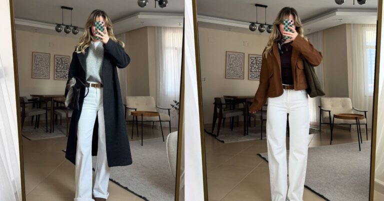
Step 2: You Need High Contrast Energy
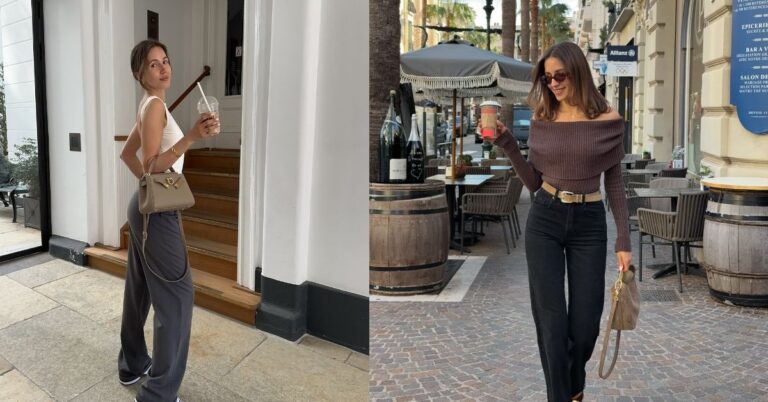
Okay, so let’s talk about layering. The best part of modest fashion is layering, right? But if you layer three different shades of light beige on top of each other, you run the risk of looking like a blob. You lose your shape, and the outfit loses its structure.
To keep things looking sharp and professional for the office, you need to add contrast.
I learned this the hard way when me and my best friend Sarah went shopping a few months ago. We were in the fitting room, and I tried on this gorgeous all-sand outfit. Wide leg trousers, a blouse, and a blazer. All the exact same sand color.
Sarah looked at me and went, “Anne, I love you, but you look like you’re about to go on a safari, not to a marketing pitch.”
She was so right. It was just too flat. So, we started swapping things out. We kept the sand trousers, but added a rich espresso brown turtleneck, and a soft ivory blazer on top. The difference was insane. The dark brown grounded the outfit, and the ivory brightened up my face.
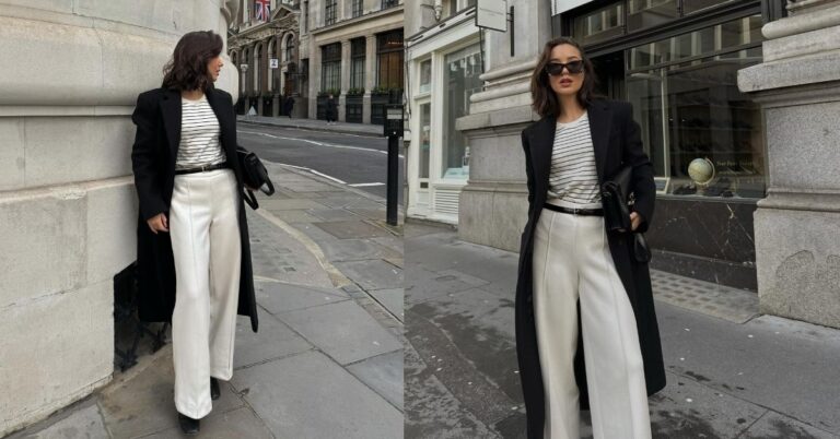
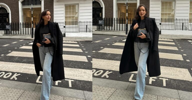
Whenever you are putting together a modest neutral outfit, try to mix light and dark. If your pants and top are light, throw on a dark cardigan or blazer. If you are wearing a dark charcoal maxi skirt, wear a crisp white button-down. That contrast is what makes the outfit look intentional and high-end, rather than just a bunch of fabric thrown together.
Step 3: Texture is Literally Everything
This is probably my favorite trick, and it’s the easiest one to implement today.
When you are wearing a lot of neutral fabrics to cover up, you absolutely have to mix your textures. If you wear cotton pants with a cotton shirt and a cotton jacket, the outfit will look incredibly dull. The light hits all of those pieces exactly the same way.
But what if you mix things up?
Imagine a pair of smooth, flowy silk-blend trousers in a soft mocha color. Now pair that with a chunky, ribbed knit sweater in cream. Add some polished leather boots. Do you see what I mean? Even though the colors are quiet and neutral, the outfit is so interesting to look at because of the different materials.
For the office, I am obsessed with mixing these specific textures:
- Satin or Silk blends: They reflect light, which instantly brightens you up. A silk modest blouse under a structured blazer is chef’s kiss.
- Chunky knits: These add coziness and dimension. A heavy knit cardigan over a smooth dress is a perfect combo.
- Tailored wool: This adds structure. Modesty doesn’t have to mean shapeless! Structured wool trousers or a sharp blazer give you that powerful boss energy.
Just by swapping out flat fabrics for textured ones, your neutrals go from boring to “where did you buy that?”
My Holy Grail Outfit Formulas
Okay, so I want to leave you guys with some super easy, totally actionable outfit recipes. You can literally copy and paste these into your work week, and I promise you will look amazing. No washed-out ghost vibes here.
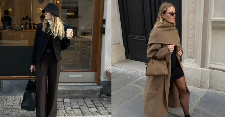
Formula 1: The “Rich Mom” Coffee Run
This is my go-to when I’m running late but need to look like I own 51% of the company. Start with wide-leg trousers in a deep navy blue. Navy is a neutral, guys, and it’s so much less harsh on the skin than pure black! Pair it with a classic, crisp white poplin button-down shirt – make sure it’s an oversized fit so it’s perfectly modest. Throw a camel sweater over your shoulders. Add some pointed-toe flats. It is so simple but the color contrast is just stunning.
Formula 2: The Monochromatic Dream
If you really want to do the one-color look, you have to do it with different textures. I love taking a slip skirt in a dark chocolate brown, and wearing it with a slightly oversized, fluffy brown mohair sweater. The textures are so different that the outfit has tons of depth. I usually add a gold belt over the sweater to give my waist a little definition without being too tight.
Formula 3: The Soft Olive Pivot
If you are so sick of beige, try olive green. It acts just like a neutral but has a little more life to it. I love wearing a long, modest olive green shirt dress, and layering a soft cream-colored sleeveless vest over it. It covers everything perfectly, it’s super comfortable for sitting at a desk all day, and the green brings out such a nice glow in the skin.
The Final Touch: Don’t Forget the Details
Okay, one last tiny story before I let you go. Even when I figured out my undertones and started mixing textures, I still felt like my face was missing something when I wore lighter colors to the office.
I was facetiming my older sister while getting ready one morning. I was wearing this gorgeous ivory blouse, but I felt kind of blah. She literally just told me, “Put on some blush and your gold hoops.”
I did, and wow. It changed everything.
When you wear neutrals, your clothes aren’t reflecting any bright colors onto your face. You have to add the warmth back yourself! A swipe of warm peach or rosy blush makes a massive difference. And don’t be afraid of a slightly darker lip liner or a tinted lip oil just to bring some contrast back to your features.
Also, jewelry is your best friend. A pair of chunky gold or silver earrings placed right next to your face brings the light exactly where you want it. It frames your face and makes you look incredibly polished and awake.
Just a little note - some of the links on here may be affiliate links, which means I might earn a small commission if you decide to shop through them (at no extra cost to you!). I only post content which I'm truly enthusiastic about and would suggest to others.
And as you know, I seriously love seeing your takes on the looks and ideas on here - that means the world to me! If you recreate something, please share it here in the comments or feel free to send me a pic. I'm always excited to meet y'all! ✨🤍
Xoxo Alice