15+ Colorful Business Card Ideas That Stand Out Instantly
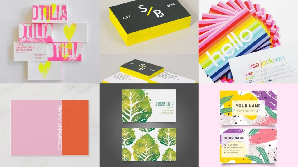

There’s a myth floating around that a business card only works if it’s plain white with black text. Not true at all!
A card with real color still reads as professional; it just also gets remembered, which is kind of the whole point of handing one out.
This list rounds up 15 color forward directions for anyone rethinking their card this year. Some lean bold and graphic.
Others keep the palette loud but the layout simple.
Read also: 16+ Genius Business Card Ideas Unique That Stand Out
You won’t find generic tips here. Each entry points to one specific design choice, like a foil accent or a stripe pattern, so you can see exactly what makes it work.
Think of this as a lookbook rather than a rulebook. Pull the color combo you love from one, the layout from another, and build your own mashup.
A few of these are dramatic enough for a creative studio. Others stay quiet enough for a consultant who still wants a little personality on the card.
Scroll through, save the ones that catch your eye, and use them as a starting point with your printer or designer.
COLORFUL BUSINESS CARD IDEAS
Neon Pink Card Inspiration

Neon pink grabs attention before anyone even reads the name on the card. It works especially well for anyone in a creative field who wants to signal energy right away.
Pair it with plain white text for contrast. Too many colors on top of neon pink and the whole thing turns muddy fast.
Bold Color Block Layout

This layout splits the card into two or three solid color sections instead of blending them. It reads clean, almost like a tiny poster.
Keep the type in one consistent color across every block. That’s what keeps a color block design looking organized instead of chaotic.
Electric Blue Foil Accents

Foil catches light in a way flat ink never will. Electric blue foil on a dark card front looks genuinely striking under office lighting.
This is a nice option if your brand already leans tech or digital. It photographs well too, which matters if the card ends up on social media.
Bright Yellow Statement Cards
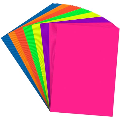
Bright yellow is a bold choice, no doubt about it. Some people will love it immediately and others will need a second to warm up, lol!
Balance it with black or navy text so the name stays legible. This combo tends to work best for anyone whose brand already feels upbeat and direct.
Holographic Shine Card Design

Holographic finishes shift color depending on the angle you’re holding the card at. One second it looks silver, the next it’s throwing rainbow light everywhere.
It’s a fun texture but not one you’d want on every line of text. Save the holographic shine for the border or the logo mark and keep the rest simple.
Purple Ombre Card Style

A purple gradient moving from deep violet to a soft lilac gives a card real depth without adding a single pattern.
This style suits anyone in wellness, beauty, or events. It photographs beautifully in natural light, which is worth considering if the card gets shared online often.
Rainbow Stripe Card Layout

Stripes across the front instantly make a card feel playful. Rainbow stripes especially work if your business already has a fun, approachable tone.
Keep the stripes thin and evenly spaced so the layout doesn’t feel busy. A wide white margin around the edge helps the whole design breathe.
Playful Polka Dot Cards

Polka dots are having a moment again, and honestly, they never really left. Scattered dots in two or three colors give a card a lighthearted, almost vintage feel.
This one works nicely for anyone running a bakery, boutique, or kids’ brand. Not every dot needs to match either; a little variation in size keeps it interesting.
Bright Coral Minimalist Design

Coral is a warm, friendly color that still reads as polished. Combined with a minimalist layout, it avoids feeling like a novelty card.
Read also: The Best 59+ Simple Summer Nails You NEED to Try
Just one line of coral, maybe behind the logo, is often enough. The rest of the card can stay white with simple black text.
Retro Pop Art Cards

Pop art borrows bold outlines, primary colors, and halftone dots straight from vintage comic pages. It’s a strong choice if you want a card that feels a little rebellious.
Ben Day dots in the background add texture without cluttering the layout. This style tends to earn a spot in creative portfolios more than corporate settings.
Turquoise Splash Card Concept

Turquoise has that beachy, easygoing quality that instantly softens a design. A splash effect, like paint dripped across the corner, adds movement without much extra work.
Read also: 18+ Stunning Colorful Coffee Bar Ideas That Transform Kitchens
This pairs nicely with travel, hospitality, or wellness branding. Keep the splash contained to one corner so the contact details stay easy to read.
Vivid Green Nature Theme

Vivid green with leaf or botanical shapes signals sustainability at a glance. It’s an easy visual shortcut for anyone in landscaping, gardening, or eco friendly retail.
Real photography of leaves can work here too, not just illustration. Either way, keep the text block on a plain section so nothing competes with the greenery.
Confetti Print Business Cards

Confetti print is basically a party you can hand someone. Small dots and shapes in five or six colors scattered across the card give it an instant celebratory feel.
This design fits event planners, party supply shops, or anyone whose brand is built around fun. Who wouldn’t smile getting handed one of these?
Read also: 15+ Spring Business Card Ideas That Stand Out
Bold Magenta Typography Cards
Magenta typography turns the words themselves into the main graphic. Instead of a logo or icon, oversized bold letters in magenta fill most of the card.
Read also: 14+ Business Card Ideas Professional Designs That Convert
It’s confident, a little loud, and hard to ignore. This route suits anyone confident enough to let their name do the talking.
Colorful Abstract Brush Strokes

Last on this list, abstract brush strokes in multiple bright colors give a card a handmade, artistic quality.
No two strokes ever look quite the same, which means every card in the batch feels slightly one of a kind. That’s a nice touch if you want cards that feel personal rather than mass produced.
Related stories