16+ Stunning Fall Business Card Ideas That Stand Out
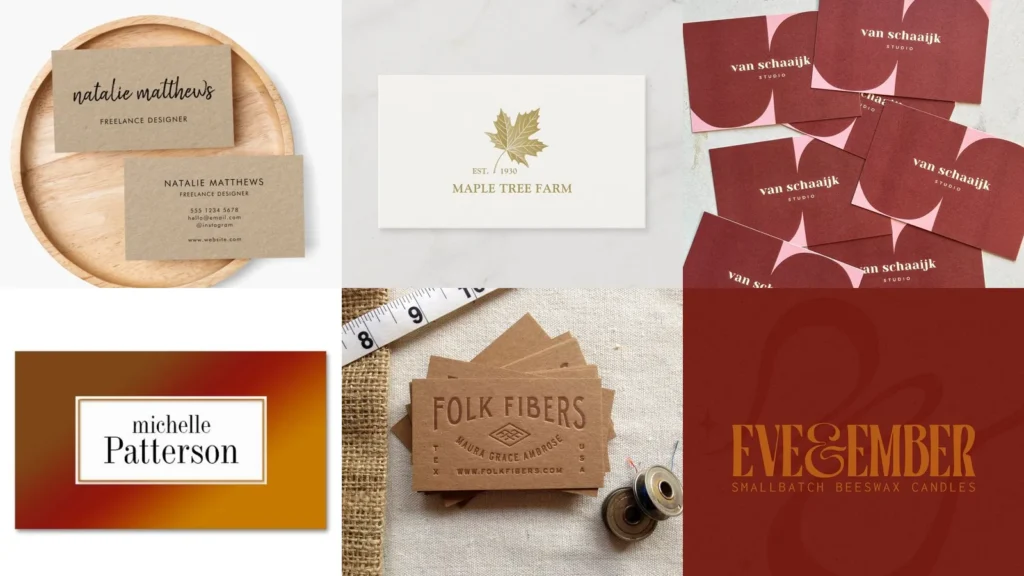

There’s a myth going around that fall business cards have to look like a pumpkin patch exploded on cardstock. Not true at all!
A card can feel warm and seasonal without turning into a craft fair table. Think texture, color and a little bit of restraint.
This list gathers 16 design directions you can actually use. Some lean rustic, some lean elegant and a few just play with color.
You’ll see kraft paper next to velvet texture and metallic ink next to hand drawn acorns. There’s something here for a minimalist and something for a maximalist too.
Read also: 17+ Genius Etsy Packaging Ideas That Boost Sales
Use this as a mood board more than a checklist. Pick one direction, or mix two if you’re feeling brave.
Under each idea you’ll find the small details that make it work. Let’s get into it!
FALL BUSINESS CARD IDEAS
Rustic Kraft Paper Business Cards

Kraft paper is where a lot of fall business card ideas start, and honestly, it makes sense. The brown tone already reads autumn before you add a single design element.
Read also: 12+ Sophisticated Neutral Business Card Ideas That Stand Out
Pair it with dark ink for contrast. A deboss or letterpress finish makes it feel a step above basic.
Maple Leaf Print Cards

Maple leaves printed in a light scatter pattern look effortless without trying too hard. Reds, oranges and a touch of yellow keep it from feeling flat.
Place them along one edge instead of covering the whole card. That leaves plenty of room for your actual contact info.
Burnt Orange Foil Accents

Foil accents in burnt orange catch the light in a way flat ink just can’t. A thin foil border or foiled initials adds shine without shouting.
This works especially well on darker backgrounds. Navy or charcoal cardstock makes the orange pop, haha, it really does jump off the page.
Minimalist Autumn Leaf Logo

Sometimes less is more. A single maple leaf icon next to your name says autumn without any extra fuss.
Keep the color palette to two tones max. This one earned a spot for anyone who wants seasonal but still professional.
Cozy Plaid Pattern Cards

Plaid brings that flannel-shirt feeling straight to your card stack. It’s a pattern most people associate with fall instantly, no explanation needed.
Use it as a border or a background wash rather than covering the whole surface. Full plaid can get busy fast.
Watercolor Fall Foliage Design

A watercolor wash of fall foliage looks handmade even when it’s printed by the thousands. Soft edges and blended colors give it warmth.
No two prints look exactly alike with this style, which is kind of the charm. It feels a little different every time.
Deep Burgundy Velvet Texture

Deep burgundy paired with a velvet-look texture feels rich immediately. This direction skips the leaves and colors entirely and leans on mood instead.
Read also: 16+ Moody Bedroom Ideas That Make You Never Want to Leave
Gold text on top of the burgundy finishes the look. It reads more formal than the rest of this list, and that’s not a bad thing.
Golden Wheat Stalk Illustration

Wheat stalks etched in gold or black ink bring a harvest feel without a single leaf in sight. It’s a nice option if maple leaves feel overdone to you.
This pairs well with cream or beige cardstock. Simple line art keeps the whole thing looking clean.
Vintage Typewriter Font Style

A typewriter font gives off an old general store feeling, all warm and a little worn. It suits a rustic or vintage brand especially well.
Stick to one font throughout the card. Mixing typewriter style with anything too modern breaks the illusion.
Autumn Sunset Gradient Cards

A gradient moving from deep orange to soft yellow mimics an actual sunset. It’s bold, it’s colorful and it does not need any extra decoration.
White text sits nicely on top of this background. Keep the layout simple so the gradient stays the star.
Hand Drawn Acorn Motif

Acorns drawn by hand add a playful, sketchy quality most printed icons don’t have. They feel a little imperfect in the best way.
Scatter a few small ones near the corners. One giant acorn in the middle can look a bit much, lol.
Cinnamon Stick Photo Backdrop
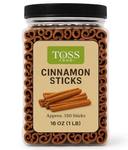
Photographing your logo or text against a bundle of cinnamon sticks gives the card a cozy, almost scented quality, even though obviously it isn’t. The texture alone does the work.
Read also: 14+ Business Card Ideas Professional Designs That Convert
This one leans more photographic than illustrated. It suits brands built around candles, baking or home goods particularly well.
Textured Linen Paper Finish
A linen paper finish adds texture you can actually feel, which changes how a card lands in someone’s hand. That small detail sticks with people.
Read also: 14+ Stunning Business Card Mockup Ideas That Convert
Pair it with a simple print job. The paper itself is already doing the heavy lifting here.
Copper Metallic Ink Details
Copper ink details bring warmth without going full metallic overload. A copper foiled edge or copper text on kraft paper looks intentional and put together.
Read also: 20+ Rustic Business Card Ideas That Actually Get Kept
This pairs beautifully with the rustic kraft option from earlier. Together they build a whole consistent set.
Harvest Market Stall Inspired
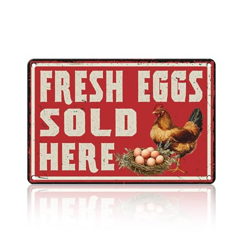
A card styled after a harvest market stall brings in crates, pumpkins and string lights in illustrated form. It feels festive without leaning too heavily on any single icon.
This direction suits seasonal pop-up businesses especially well. Farmers, bakers and small shop owners, this one’s for you.
Amber Glow Candlelight Style

Last but definitely not least, warm candlelight tones close out this list. Soft amber gradients and a flickering glow effect make the whole card feel inviting.
Keep the text in a crisp white or cream so it stays readable. This one closes things out on a genuinely cozy note.