15+ Spring Business Card Ideas That Stand Out
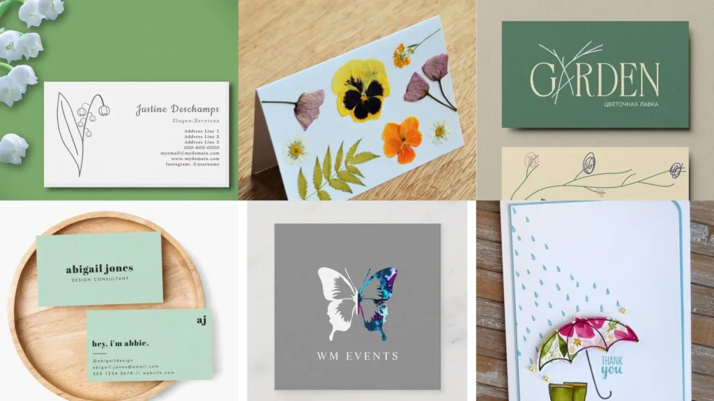

This list is for anyone staring at a blank business card template and feeling stuck. Freelancers, small shop owners, real estate agents, first-time entrepreneurs; if that’s you, welcome!
Spring is such a fun season to redesign a card. Everything feels lighter this time of year, and your card can too, lol!
Below you’ll find fifteen ideas, each one built around a different spring mood. Some lean botanical, some lean playful, a couple even lean a little moody with rain clouds.
The list moves from illustrated florals to color palettes to texture choices. That way you can scan for whatever direction fits your brand, whether that’s soft and pretty or bold and sunny.
Under each idea you’ll find the small details that actually matter, like paper choice or color pairing. Use them as a jumping-off point rather than a strict rulebook.
Ready to find your favorite? Let’s get into it!
SPRING BUSINESS CARD IDEAS
Botanical Line Art Cards

Botanical line art keeps things simple. A single continuous line sketch of a fern or a branch sits quietly in one corner.
This style works especially well for wellness brands or florists. It reads as calm without trying too hard.
Black ink on cream paper is the classic combo here, and it never really goes out of style.
Minimalist Tulip Business Card

Would you believe a single tulip can carry an entire card? It can!
One outlined tulip, tucked near the name or logo, gives just enough spring energy without crowding the layout.
Skip the extra icons. Let the tulip do the talking.
Cherry Blossom Card Inspiration

Cherry blossom branches scattered across a corner feel delicate and a little romantic. Pale pink petals against white or soft gray look especially pretty.
This one suits event planners, boutique owners, or anyone in the beauty industry. The petals can drift diagonally across the card for movement.
Read also: 16+ Genius Business Card Ideas Unique That Stand Out
It photographs beautifully too, which matters if you post your card on social media.
Pressed Flower Card Design

Pressed flower designs mimic the look of real dried petals scanned onto the card. Think tiny violets or baby’s breath arranged like a keepsake.
The effect feels handmade even when it’s printed. That contrast is honestly part of the charm.
Soft Pastel Color Palette
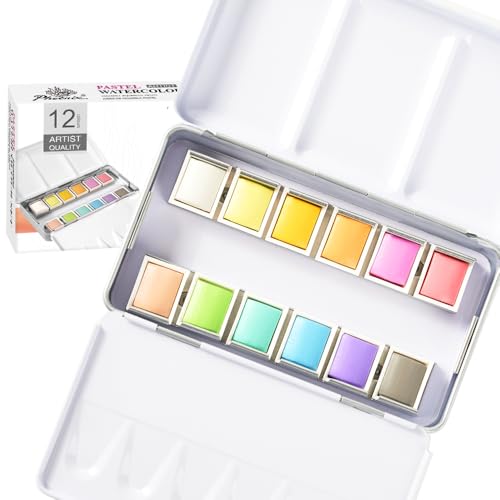
A soft pastel palette instantly says spring without a single flower on the card. Think buttery yellow, blush pink, sage green and baby blue.
Pick two colors max so the card doesn’t feel busy. Pair one pastel with plenty of white space for breathing room.
This direction works for almost any industry, honestly.
Floral Foil Stamped Cards

Foil stamping turns a simple floral outline into something that catches light. Gold foil on a pale card looks fancy without trying too hard.
Read also: 12+ Sophisticated Neutral Business Card Ideas That Stand Out
Rose gold works beautifully too, especially against blush or lavender backgrounds.
This one costs a bit more to print, so save it for a card you’re proud to hand out.
Garden Party Card Concept

Picture string lights, bunting, and a cheerful border of tiny flowers. That’s the garden party concept in a nutshell.
It suits event planners and caterers especially well. The whole design should feel like an invitation more than a formal card.
Add a scalloped edge if your printer offers it. It leans the whole thing further into party territory.
Spring Wreath Card Border

A wreath border made of small leaves and blossoms frames the card content nicely. Name and title sit right in the center like a little medallion.
This layout works great for wedding vendors or home stylists. It feels finished without needing much else on the page.
Fresh Mint Business Card

Fresh mint green as a background color feels crisp and a little unexpected. Not every spring card needs to go floral, right?
Pair mint with white text or a thin gold line for contrast. It reads clean and modern instantly.
This shade suits tech freelancers, dietitians, or anyone in a wellness field.
Daisy Pattern Card Design

Daisies are cheerful without being fussy. A repeating daisy pattern across the entire card back keeps things playful.
Save the front for your info in a plain font so the pattern doesn’t compete with the text.
This combo feels young, friendly, and approachable.
Sunny Yellow Card Accents

A pop of sunny yellow along one edge or corner brightens up an otherwise neutral card. Small doses go a long way here.
Try a yellow border strip with the rest of the card kept plain white or gray.
It’s a small touch, but it makes the card memorable.
Butterfly Illustration Card Style

Butterflies mid-flight, drawn in a simple outline style, add motion to an otherwise static card. One or two is plenty.
This style fits jewelry makers, artists, or anyone with a whimsical brand voice.
Too many butterflies and the card starts feeling cluttered, so restraint matters here.
Textured Kraft Paper Cards

Kraft paper brings texture into the mix instead of relying on color alone. The slightly rough, natural surface pairs surprisingly well with spring greenery prints.
Read also: 16+ Stunning Fall Business Card Ideas That Stand Out
This direction suits farm stands, bakeries, or eco-friendly brands. It feels grounded next to all the pastel florals on this list.
Hand Lettered Spring Cards

Hand lettered text gives a card real personality. A swirly script name paired with a small sprig of leaves feels personal and warm.
Read also: 20+ Rustic Business Card Ideas That Actually Get Kept
This works especially well for calligraphers, bakers, or anyone selling something handmade. The lettering itself becomes the design.
Keep the rest of the card minimal so the script stays the star.
Rainy Day Umbrella Motif

Last on this list is a rainy day umbrella motif, and honestly it’s a nice break from all the flowers. A single open umbrella with a few raindrops adds charm without feeling cliche.
This suits anyone who wants a spring card that isn’t strictly floral. Not every April day is sunny, after all!
Pair it with muted blues and grays for a calm, moody finish.