12+ Sophisticated Neutral Business Card Ideas That Stand Out
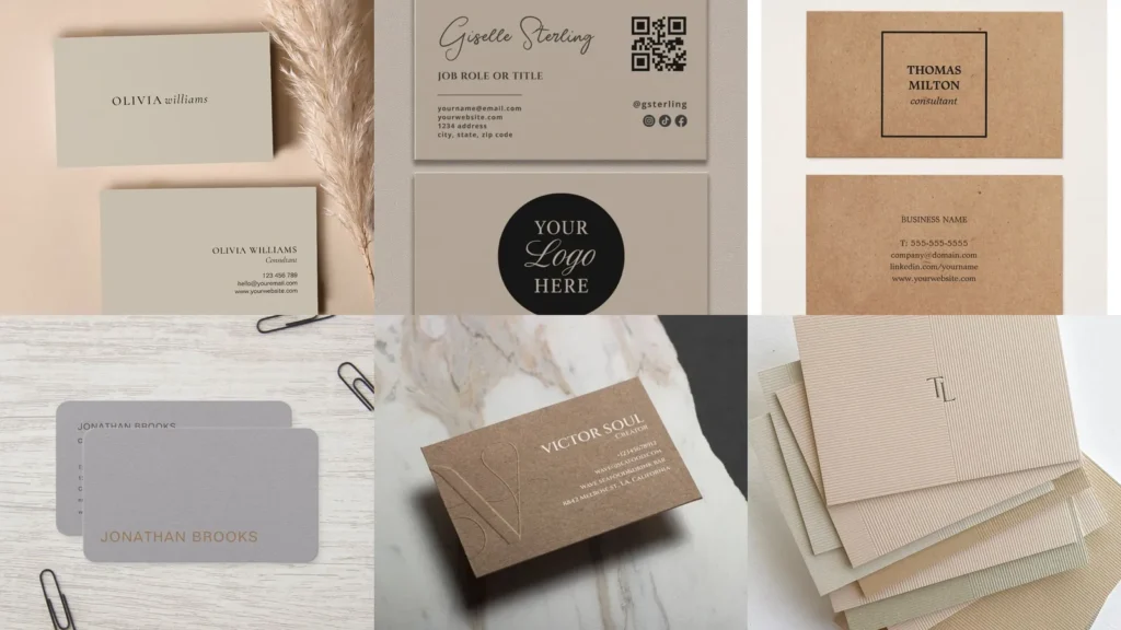

Staring at a blank template and dreading another round of business card options? Same!
There are a million fonts and colors out there and picking just one can eat your whole afternoon.
That’s exactly why this list exists. It narrows things down to designs that actually look put together without trying too hard.
Neutral palettes work for almost any industry, whether you’re a photographer, a consultant or running a little shop of your own. Beige, cream, taupe and gray never really go out of style, which makes them a safe bet for 2026.
Below you’ll find 12 neutral business card ideas that lean calm instead of loud. Some use texture, some use foil, some keep it plain and let the typography do the talking.
Read also: 16+ Stunning Fall Business Card Ideas That Stand Out
Scroll through and pick out a couple that catch your eye. You can mix elements from a few different ones too, nobody says you have to copy just one exactly, lol!
Under each idea you’ll find a quick note on what makes it work plus a link to see the full design up close.
NEUTRAL BUSINESS CARD IDEAS
Minimalist Beige Business Card

We’re starting off with a minimalist beige card and it sets the tone for this whole list. Simple type, plenty of white space and nothing shouting for attention.
This is the one to copy first if you’re new to designing your own cards. Beige backgrounds photograph beautifully too, which matters if you’re posting your branding online.
Cream Linen Texture Card

Cream linen texture brings a paper-goods feel straight into your wallet. Run your thumb across a card like this and you can practically feel the fibers.
It reads a little more traditional, almost like a wedding invitation. That’s not a bad thing if your business leans classic.
Soft Taupe Card Layout

A soft taupe layout is the quiet one on this list. Nothing about it screams for attention, and honestly that restraint is the whole point.
Taupe sits right between gray and brown, so it pairs with almost any logo color you throw at it. Consider it the neutral of all neutrals.
Matte White Card Design

Matte white keeps things crisp without the shine of a glossy finish. Fingerprints and smudges show up far less on matte stock, which is a small but real perk.
This design leans clinical in the best way. Doctors, architects and designers tend to gravitate toward this look.
Kraft Paper Business Card

Kraft paper adds warmth that plain white just can’t match. The brown fleck texture gives off a handmade, small-batch feeling instantly.
Bakeries, coffee shops and farm stands look right at home on kraft stock. It’s rustic without trying too hard, and that balance is tough to fake.
Sand Tone Card Mockup

This sand tone mockup shows the card sitting against a matching background, which is a smart way to preview your design before printing.
Read also: 14+ Stunning Business Card Mockup Ideas That Convert
Sandy hues photograph warm under most lighting. That makes them a solid pick if your cards will live on Instagram as much as in a wallet.
Ivory Foil Stamped Card

Ivory with foil stamping is where things get a little fancy. Gold or copper foil against an ivory base looks expensive without actually costing a fortune.
Save this style for a business that wants to feel a step above the rest. Real estate agents and event planners use this look often, and it works.
Muted Gray Card Style

Muted gray keeps things modern and just a touch cool. It photographs cleanly under office lighting, which matters more than people realize.
This shade pairs nicely with black text or a single accent color. Skip loud graphics here and let the gray do the heavy lifting.
Neutral Card With Wax Seal

A wax seal on a neutral card turns something ordinary into a little keepsake. Guests notice it immediately, and it slows people down long enough to actually read your name.
Read also: 17+ Genius Etsy Packaging Ideas That Boost Sales
This one takes slightly more effort to produce than the rest. Worth it for a launch event or a boutique brand that wants to feel special.
Textured Cardstock Neutral Palette

Textured cardstock in a neutral palette gives your fingers something to notice, not just your eyes. Cotton stock, felt finishes and pressed paper all fall into this category.
Read also: 20+ Rustic Business Card Ideas That Actually Get Kept
The texture does most of the design work here. Keep the printed elements simple so the paper itself gets to shine.
Calligraphy Style Neutral Card

Calligraphy script against a plain neutral background feels personal in a way that typed fonts rarely manage. Every loop and tail adds a little character.
This style suits stationers, florists and anyone in the wedding industry. It slows the eye down, which is exactly what you want on a card someone actually keeps.
Neutral Card Stack Flatlay

Last but definitely not least, a full stack flatlay shows how a whole set of neutral cards looks fanned out together. It’s the best way to judge consistency across an entire print run.
Line a few tones up side by side before you commit. Small differences between beige, cream and taupe become obvious once they’re stacked, and that’s worth catching early.