14+ Stunning Business Card Background Ideas That Convert
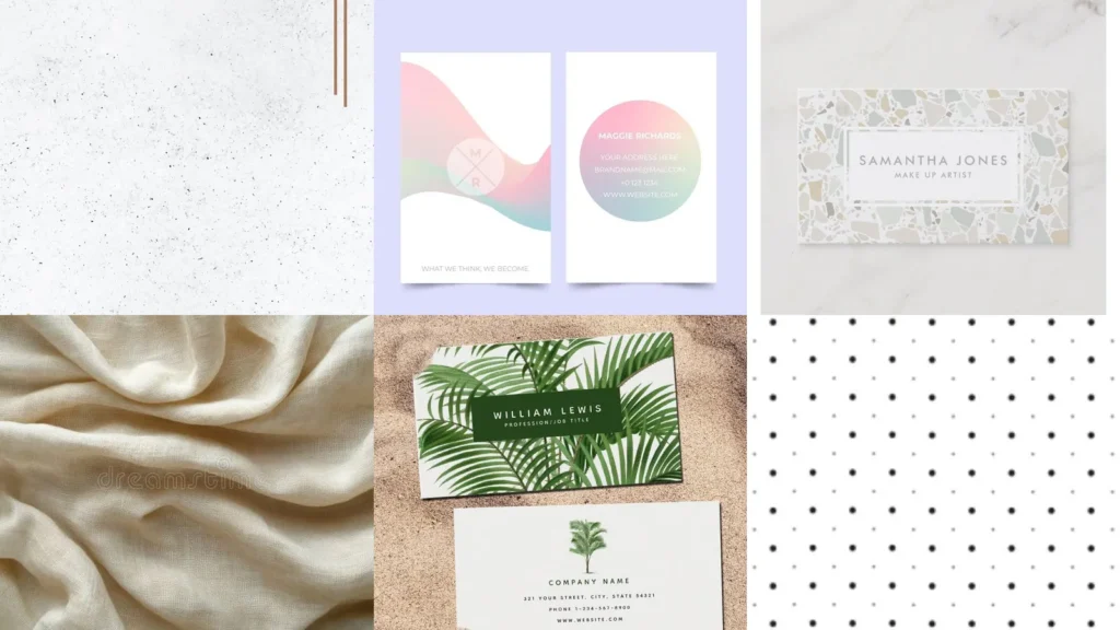

There’s a myth that a business card background has to be plain white to look professional. That’s just not true anymore!
Plenty of the boldest cards out there use color, texture and even pattern to stand out in a stack. A busy background can still read as clean and polished, as long as the text stays legible.
Read also: 16+ Genius Business Card Ideas Unique That Stand Out
This list rounds up 14 background styles worth considering for your next print run. Some lean minimal, some lean maximalist, and a few sit somewhere in between.
Use it as a quick reference when you’re stuck staring at a blank design template. Scroll through, save your favorites and mix elements if something speaks to you.
Each idea below includes a small detail worth noticing plus a link where a similar look gets built step by step. No design degree required, lol!
Ready to see what’s out there? Let’s get into it.
BUSINESS CARD BACKGROUND IDEAS
Minimalist White Marble Background
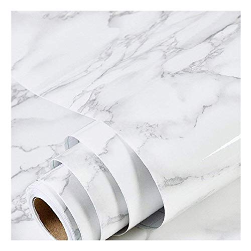
White marble never really goes out of style, does it? The soft gray veining keeps things calm while still looking expensive.
This background works for basically any industry. A real estate agent and a jewelry designer could both use this one and it would suit either brand.
Elegant Black Gold Foil

Black paired with gold foil is drama done right. The contrast makes even a short title feel important.
Consider this the pick for anyone in luxury goods, event planning or beauty. It photographs beautifully too, which matters more than people realize.
Rustic Kraft Paper Texture

Kraft paper texture brings in warmth that white card stock just can’t match.
This suits farm stands, coffee roasters and anyone selling something handmade. The slightly rough look tells people you’re not mass produced, and honestly that’s the whole point.
Pastel Gradient Ombre Style

How pretty is this pastel gradient? The color shifts from soft pink to lavender without any hard lines.
It’s a gentle option for wellness brands, florists or anyone with a softer visual identity. Not every card needs to shout.
Modern Abstract Line Art
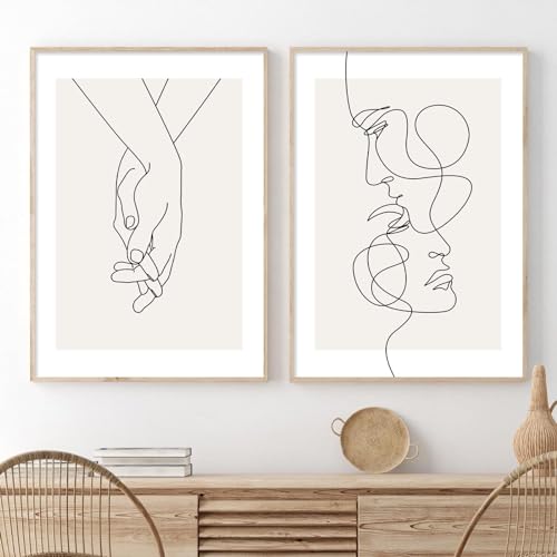
Abstract line art gives a card personality without adding clutter.
A few curved lines in one corner can do more work than a full illustration. Designers and architects tend to gravitate toward this style, and it makes sense why.
Chic Terrazzo Stone Pattern

Terrazzo has had a moment for a few years now and it’s not slowing down.
The scattered chips of color keep the eye moving across the card. This one works especially well for interior designers or anyone in a creative studio.
Vintage Botanical Illustration Print

Vintage botanical prints bring an old book feel to a modern card.
Think delicate leaves and pressed flowers rendered in muted ink tones. Garden centers, tea shops and stationery brands all lean on this look for good reason.
Read also: 16+ Stunning Fall Business Card Ideas That Stand Out
Holographic Metallic Shine Effect

Holographic shine catches light in a way flat paper simply can’t.
It’s playful, a little unexpected and definitely memorable. Save this one for a brand that wants to feel fun rather than formal.
Soft Linen Fabric Texture

Linen texture adds a tactile quality you can almost feel through a photo.
The subtle woven pattern reads as thoughtful rather than plain. Law firms and financial advisors often choose this because it feels steady and established.
Bold Neon Color Blocks

Neon color blocks are the opposite of subtle, and sometimes that’s exactly the point.
Two or three bold shades divided into sections make a card impossible to lose in a drawer. Creative agencies and event promoters use this to get noticed fast.
Tropical Palm Leaf Print

Tropical palm leaves bring instant warmth to a card design.
Picture a resort, a tiki bar or a travel agency and this background makes total sense. The green tones also pair nicely with gold text if you want a little shine on top.
Art Deco Gold Pattern
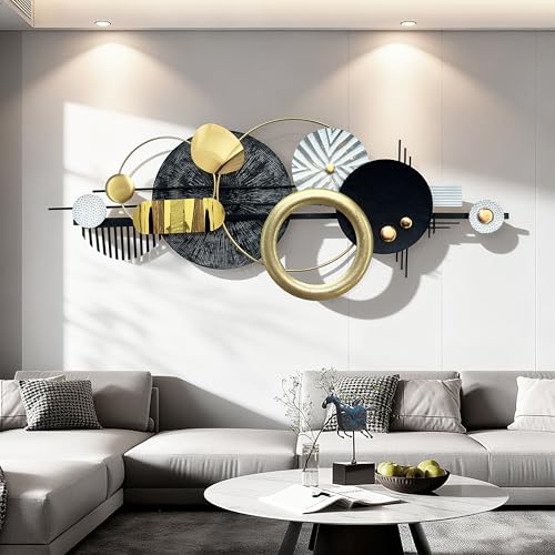
Art Deco patterns bring geometric gold shapes that feel pulled from an old hotel lobby.
Fan shapes, sharp angles and metallic lines give off serious old money energy. Event planners and boutique hotels use this style often, and it never looks dated.
Wood Grain Natural Texture

Wood grain texture brings the outdoors into an otherwise flat design.
The natural rings and knots give a card an earthy, grounded feel. Woodworkers, carpenters and outdoor brands lean on this the most, which tracks.
Read also: 20+ Rustic Business Card Ideas That Actually Get Kept
Chic Polka Dot Design

Last but definitely not least, polka dots bring a cheerful, retro energy.
Small dots scattered across a soft background feel playful without being childish. This one suits bakeries, boutiques and anyone whose brand has a lighter, friendlier tone. It’s a fun note to end the list on!
Read also: 15+ Colorful Business Card Ideas That Stand Out Instantly