20+ Rustic Business Card Ideas That Actually Get Kept
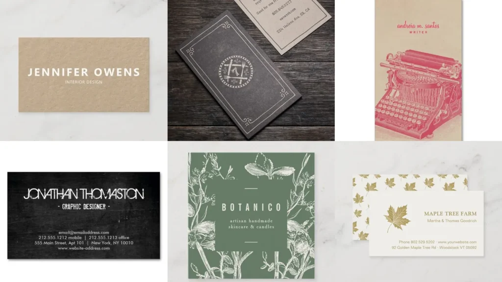

By the end of this list you’ll have twenty different directions for a card that actually looks like you made it on purpose.
Rustic business card ideas cover a lot of ground, so this roundup pulls from kraft paper, foil accents, hand lettering and a bunch of natural textures.
Read also: 12+ Sophisticated Neutral Business Card Ideas That Stand Out
Some of these lean into farmhouse and some lean into cozy autumn tones, so there’s a decent spread here no matter your brand.
Each idea below focuses on one clear detail you can actually copy, whether that’s a font choice, a material or a color palette.
Use this list as a starting point rather than a strict rulebook. Mix two ideas together if that fits your brand better!
Ready to see all twenty? Let’s get into it.
RUSTIC BUSINESS CARD IDEAS
Kraft Paper Business Cards

Kraft paper is basically the backbone of rustic business card ideas, and for good reason.
Read also: 16+ Stunning Fall Business Card Ideas That Stand Out
The warm brown tone reads handmade before anyone even reads the text on it.
Pair it with simple black ink and the whole thing feels grounded instead of flashy.
Twine Wrapped Card Display

A little twine wrapped around a stack of cards turns a boring pile into a display piece.
Read also: 17+ Genius Etsy Packaging Ideas That Boost Sales
This works great at farmers markets or craft fairs where cards sit out on a table.
It also just smells like fall, doesn’t it, haha!
Wood Veneer Business Cards
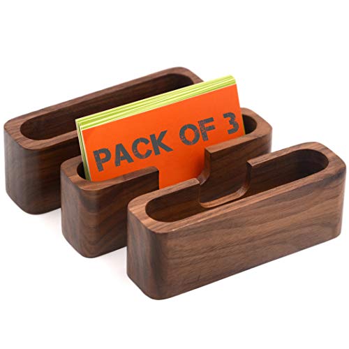
Wood veneer cards feel like a genuine keepsake instead of something that gets tossed in a drawer.
They’re thin enough to write on, sturdy enough to survive a wallet.
Not every printer offers this option, so it’s worth calling ahead before you commit to a design.
Botanical Pressed Flower Cards
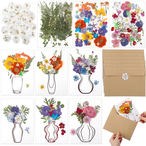
Pressed flowers add a botanical touch that photographs beautifully for social media.
Each card ends up a little different since real petals never sit the same way twice.
That’s a feature, not a flaw, in my opinion.
Letterpress Rustic Card Design

Letterpress printing gives a card actual texture you can feel with your thumb.
There’s something satisfying about that slight indent in the paper.
It costs a bit more per card, so this one’s best saved for a smaller print run.
Burlap Textured Card Background

Burlap texture on a card background instantly says farmhouse without a single extra graphic.
The woven pattern works especially well behind cream or ivory text.
Skip this one if your brand leans modern. It just won’t match, lol!
Farmhouse Style Logo Cards

A farmhouse style logo usually means simple line art paired with a classic serif font.
Read also: 14+ Business Card Ideas Professional Designs That Convert
Think barn silhouettes, wheat sprigs or a simple wreath around initials.
It’s a clean look that ages well over the years.
Hand Stamped Card Details

Hand stamped details give every card a slightly imperfect, handmade edge.
A small stamped icon near the name adds personality without cluttering the layout.
This is a fun option if you already own a stamp set.
Vintage Typewriter Font Cards
Vintage typewriter fonts bring a nostalgic, storytelling feel to a card.
The slightly uneven letter spacing actually works in its favor here.
Pair it with cream cardstock for the full old-fashioned effect.
Recycled Paper Card Texture

Recycled paper stock has a rougher texture that fits rustic branding perfectly.
You can usually spot little fiber flecks throughout the paper.
It’s an easy way to signal eco friendly values without saying a word about it.
Watercolor Wildflower Card Border

A watercolor wildflower border softens up an otherwise plain card layout.
Keep the flowers along one edge so the text stays easy to read.
This pairs nicely with a handwritten style name across the middle.
Mini Chalkboard Card Style

Mini chalkboard style cards use a dark background with white lettering that mimics real chalk.
It reads a little playful, a little rustic diner menu.
Great for bakeries, coffee shops or anyone selling something delicious.
Linen Textured Card Stock
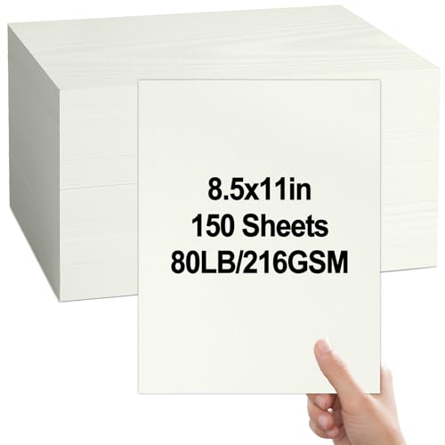
Linen textured cardstock has a subtle woven feel under your fingers.
It’s a step up from plain matte paper without looking flashy.
Many print shops offer this as a paper upgrade for a small fee.
Copper Foil Rustic Accents

Copper foil accents add a warm metallic shine against darker rustic backgrounds.
A thin copper border or foiled initials catches the light just enough.
It’s a small detail, but it makes the whole card feel a bit more polished.
Barnwood Inspired Card Layout

Barnwood inspired layouts use a wood grain texture as the card’s main background.
The grain pattern gives the design instant warmth and texture.
This one lands really well for outdoor businesses like landscaping or woodworking.
Sage Green Earthy Palette
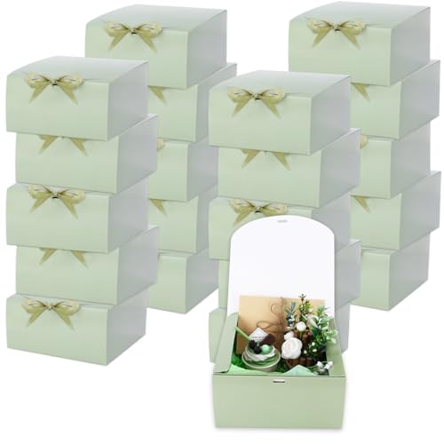
Sage green sits right in the middle of earthy and elegant.
It pairs beautifully with cream, gold foil or simple black text.
Honestly, this might be the easiest palette on this entire list to get right.
Handwritten Script Card Font

A handwritten script font gives a card a personal, signature feel.
Use it sparingly though, maybe just for the name or the tagline.
Too much script gets hard to read fast.
Terracotta Tone Card Design

Terracotta tones bring a sunbaked, earthy warmth that pairs well with cream text.
It’s a color that feels both autumn and Mediterranean at once, which is a fun combination.
Consider this one if your brand already leans warm and inviting.
Leather Embossed Card Holder
A leather embossed card holder isn’t the card itself, but it completes the whole presentation.
Read also: 14+ Stunning Business Card Mockup Ideas That Convert
Handing someone a card from a worn leather sleeve just feels more intentional.
This is the kind of detail that gets noticed at a networking event.
Autumn Leaf Card Accent

Last but definitely not least, an autumn leaf accent brings a seasonal touch to any rustic layout.
A single pressed or printed leaf in the corner is all it takes.
It’s a small, simple way to close out this list on a cozy note!